Regression
Earlier we looked at how to examine sample data to investigate the nature of any relationship that may exist between a measured response variable and an attribute explanatory variable. This section examines how to investigate the nature of any relationship that may exist between a measured response variable and a measured explanatory variable.
The first step is to have a clear idea of what is meant by a connection between the response variable and the explanatory variable. The next step is to use some simple sample descriptive statistics to have a first look at the nature of the link between the response variable and the explanatory variable. This simple approach will lead to one of three conclusions, namely, on the basis of the sample information:
- there is very strong evidence to support a link
- there is absolutely no evidence of any link
- the sample evidence is inconclusive and further more sophisticated data analysis is required
This step is called the Initial Data Analysis or the IDA.
If the IDA suggests that Further Data Analysis is required, then this step seeks one of two conclusions:
- The sample evidence is consistent with there being no link between the response variable and the explanatory variable.
- The sample evidence is consistent with there being a link between the response variable and the explanatory variable.
As we have already seen in the previous sections, this process can be represented diagrammatically as:
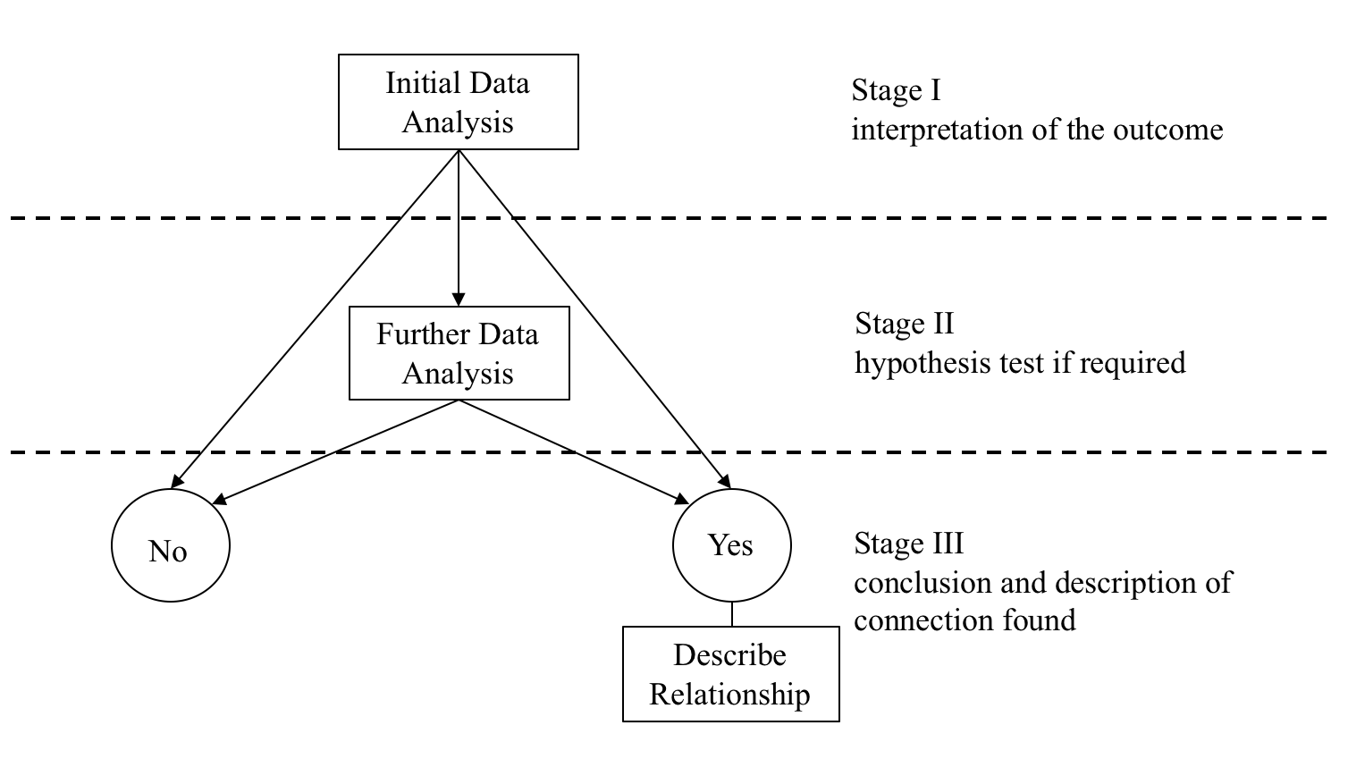
The Data-Analysis Methodology seeks to find the answer to the following key question:
- On the basis of the sample data, is there evidence of a connection/link/relationship between the response variable and the explanatory variable?
The final outcome is one of two conclusions:
There is no evidence of a relationship, labelled as the ‘No’ outcome in the diagram above, in which case the analysis is finished.
There is evidence of a relationship, labelled as the ‘Yes’ outcome in the diagram above, in which case the nature of the relationship needs to be described.
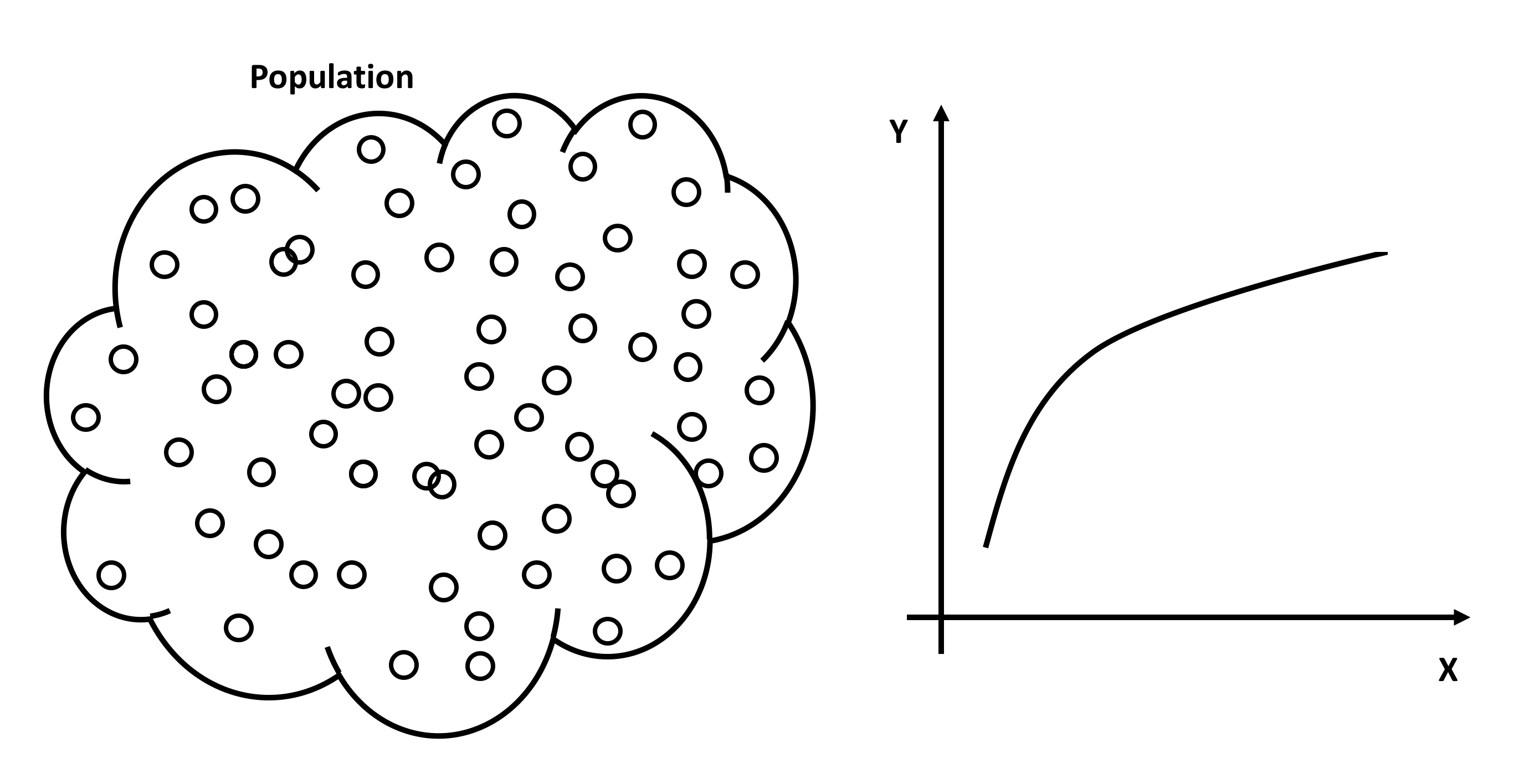
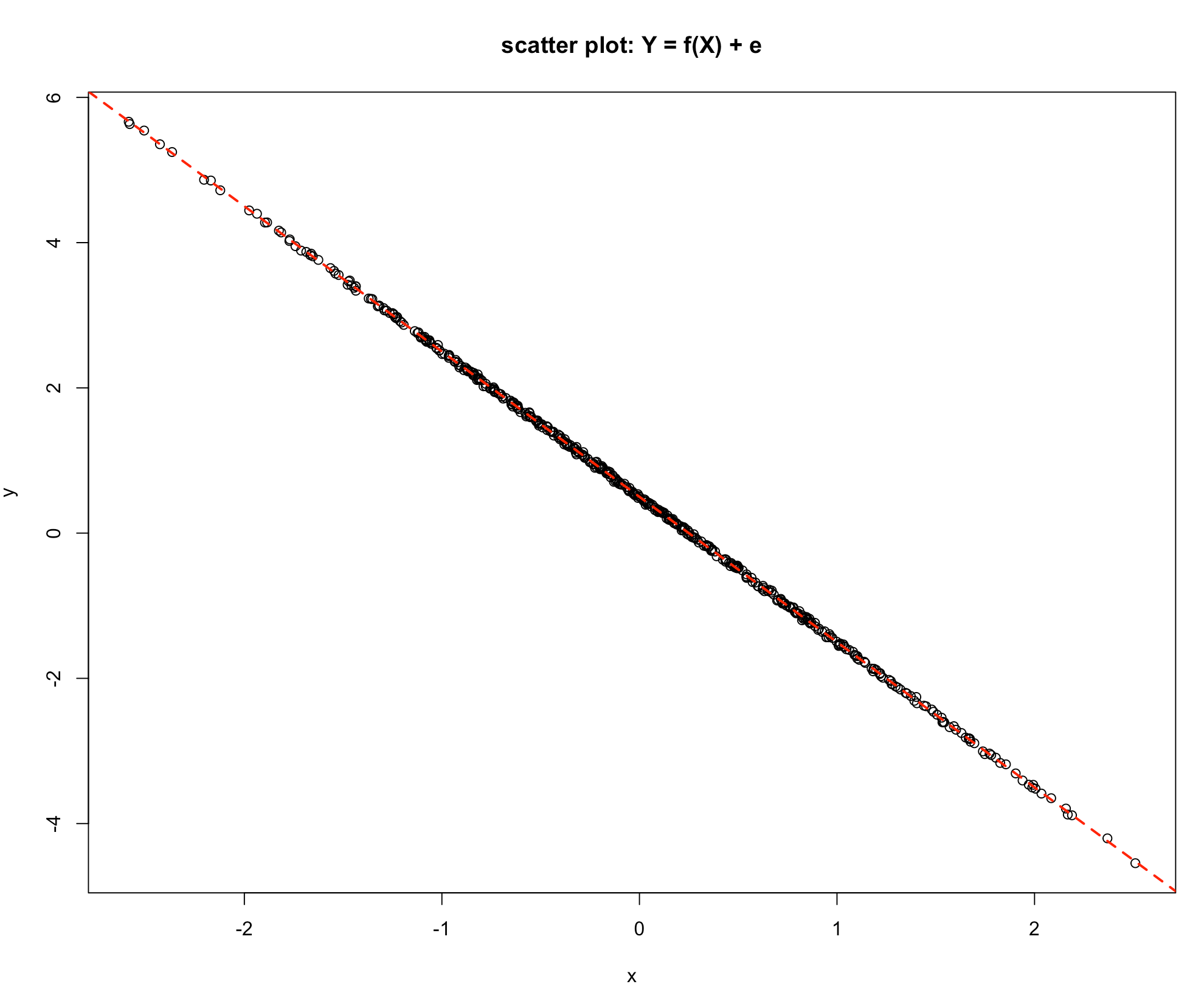
The first step is to have a clear idea of what is meant by a connection between a measured response variable and a measured explanatory variable. Imagine a population under study consisting of a very large number of population members, and on each population member two measurements are made, the value of \(Y\) the response variable and the value of \(X\) the explanatory variable. For the whole population a graph of \(Y\) against \(X\) could be plotted conceptually. If the graph looked as in the diagram below, then there is quite clearly a link between Y and X. If the value of \(X\) is known, the exact value of Y can be read off the graph. This is an unlikely scenario in the data-analysis context, because the relationship shown is a deterministic relationship. Deterministic means that if the value of \(X\) is known then the value of \(Y\) can be precisely determined from the relationship between \(Y\) and \(X\).
Scatter Plot
When analysing the relationship between the two measured variable we start off by creating a scatter plot. A scatter plot is a graph that shows one axis for the explanatory variable commonly known in the regression modelling as a predictor and labelled with \(X\), and one axis for the response variable, which is labelled with \(Y\) and commonly known as the outcome variable. Thus, each point on the graph represents a single \((X, Y)\) pair. The primary benefit is that the possible relationship between the two variables can be viewed and analysed with one glance and often the nature of a relationship can be determined quickly and easily.
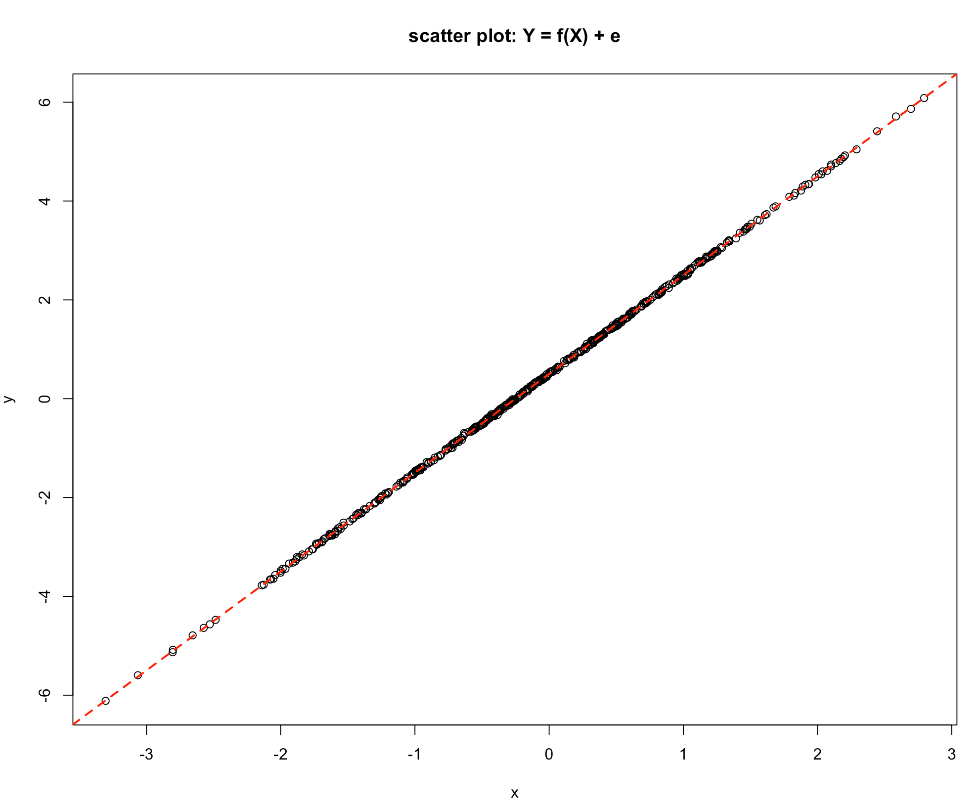
Let us consider a few scatter plots. The following graph represents a perfect linear relationship. All points lie exactly on a straight line. It is easy in this situation to determine the intercept and the slope, i.e. gradient and hence specify the exact mathematical link between the response variable \(Y\) and the explanatory variable \(X\).
-Graph 1
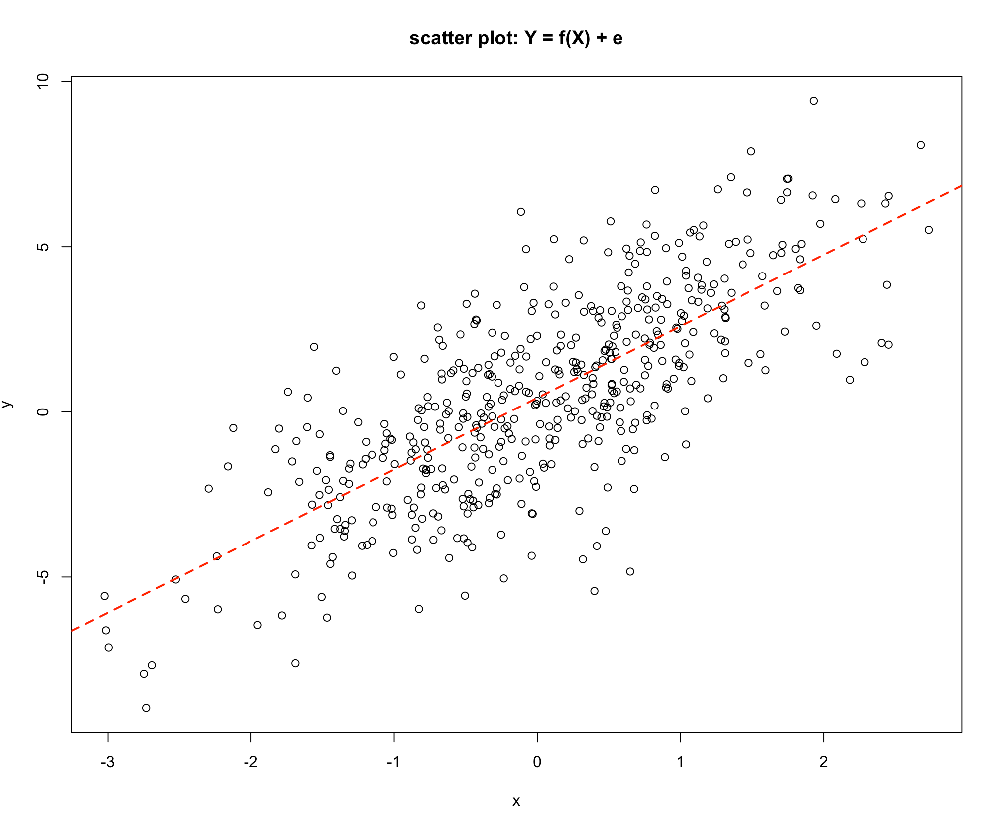
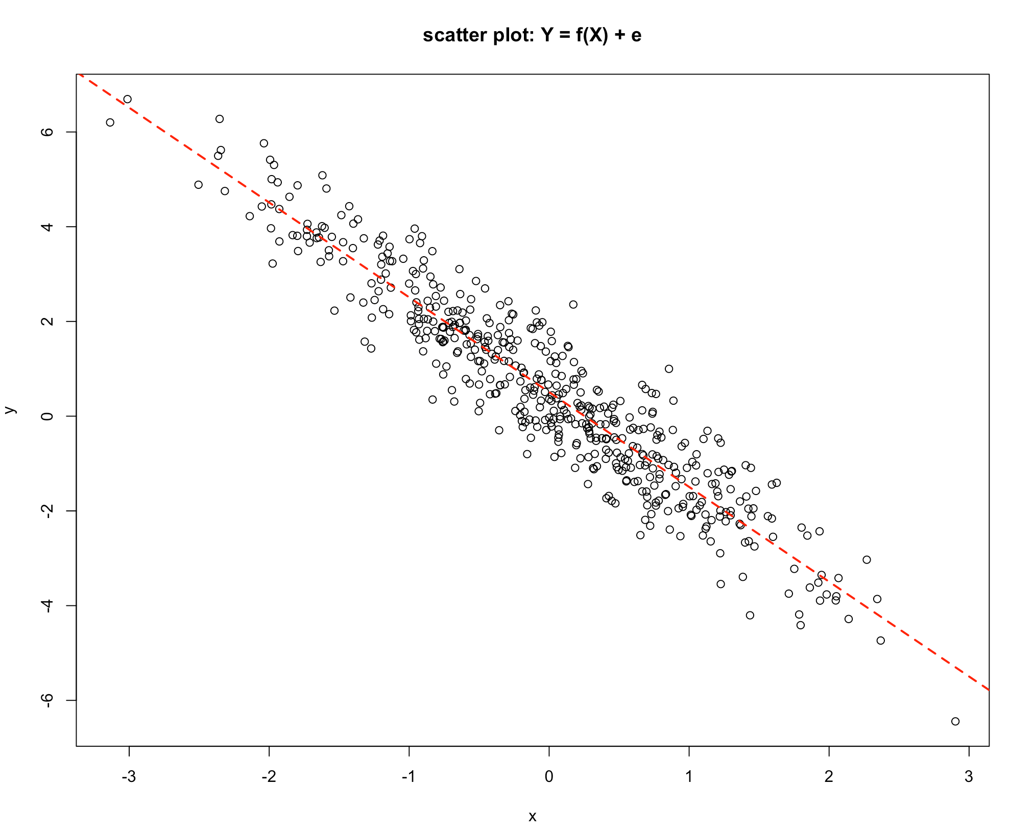
The relationship shown in Graph 2 shows clearly that as the value of \(X\) increases the value of \(Y\) indecreases, but not exactly on a straight line as in the previous scatter plot. This is showing a statistical link, as the value of the explanatory variable \(X\) increases the value of the response variable \(Y\) also tends to increase. An explanation for this is that the response \(Y\) may depend on a number of different variables, say \(X_1\), \(X_2\), \(X_3\), \(X_4\), \(X_5\), \(X_6\) etc. which could be written as:
\(Y = f(X_1, X_2, X_3, X_4, X_5, X_6, ...)\)
-Graph 2
If the nature of the link between \(Y\) and \(X\) is under investigation then this could be represented as:
\[Y = f(X) + \text{effect of all other variables}\]
The effect of all other variables is commonly abbreviated to e.
Graph 1 shows a link where the effect of all the other variables is nil. The response \(Y\) depends solely on the variable \(X\), Graph 2 shows a situation where \(Y\) depends on \(X\) but the other variables also have an influence.
Consider the model:
\[Y = f(X) + e\] Remember 😃, \(\text{e is the effect of all other variables}\)!
The influence on the response variable \(Y\) can be thought of as being made up of two components:
- the component of \(Y\) that is explained by changes in the value of \(X\), [the part due to changes in \(X\) through \(f(X)\)]
- the component of \(Y\) that is explained by changes in the other factors [the part not explained by changes in \(X\)]
Or in more abbreviated forms:
- the Variation in \(Y\) Explained by changes \(X\) or Explained Variation and
- the Variation in \(Y\) not explained by changes in \(X\) or the Unexplained Variation
The Total Variation in \(Y\) is made up of two components:
- Changes in \(Y\) Explained by changes in \(X\) and the
- Changes in \(Y\) not explained by changes in \(X\)
Which may be written as:
\[\text{The Total Variation in Y} = \text{Explained Variation} + \text{Unexplained Variation}\]
In Graph 1 the Unexplained Variation is nil, since the value of \(Y\) is completely determined by the value of \(X\). In Graph 2 the Explained Variation is large relative to the Unexplained Variation, since the value of \(Y\) is very largely influenced by the value of \(X\).
Consider Graph 3. Here there is no discernible pattern, and the value of Y seems to be unrelated to the value of X.
- Graph 3
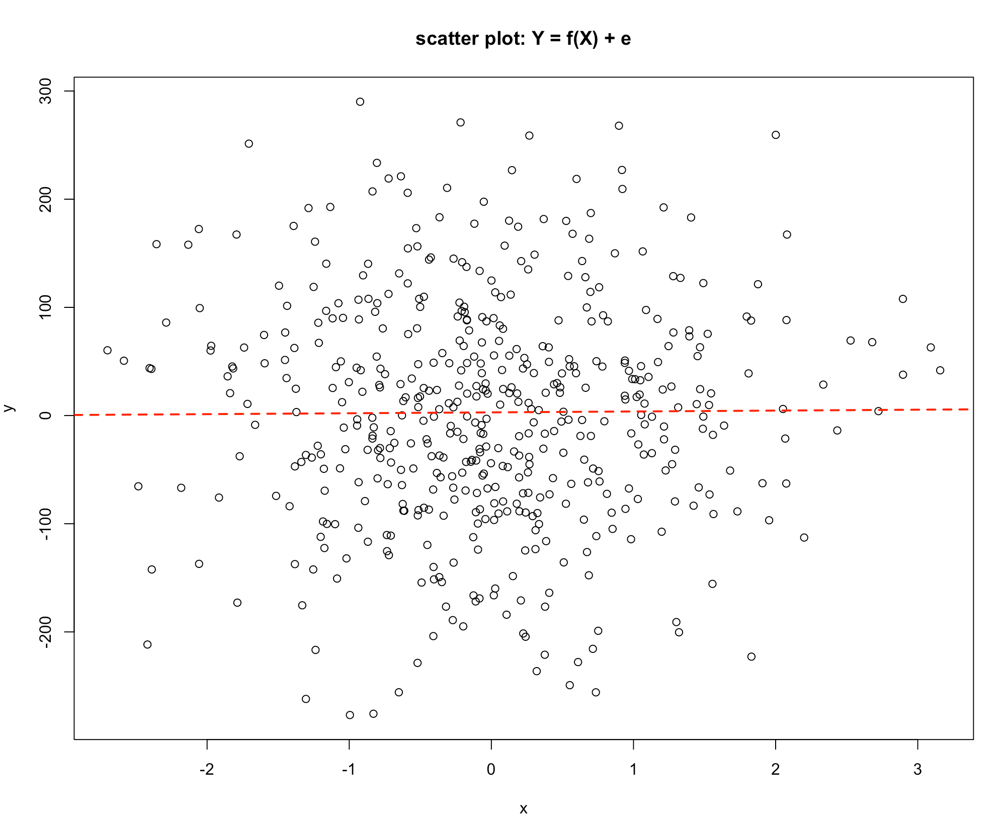
If \(Y\) is not related to \(X\) the Explained Variation component is zero and all the changes in \(Y\) are due to the other variables, that is the Unexplained Variation.
Finally, consider Graphs 4 & 5 below:
-Graph 4
-Graph 5
Graph 4 shows a similar picture to Graph 2, the difference being that as the value of \(X\) increases the value of \(Y\) decreases. The value of \(Y\) is influenced by the value of \(X\), so the Explained Variation is high relative to the Unexplained Variation. Consider the last graph, Graph 5, which is a deterministic relationship. The value of \(Y\) is completely specified by the value of \(X\). Hence the Unexplained Variation is zero.
Graphs Summary:
| Graph 1 | Graph 2 | Graph 3 | Graph 4 | Graph 5 | |
|---|---|---|---|---|---|
| Explained Variation in Y | All | High | Zero | High | All |
| Unexplained Variation in Y | Zero | Low | All | Low | Zero |
In regression the discussion started with the following idea: \[Y = f(X) + e\] And to quantify the strength of the link the influence on Y was broken down into two components: i. \[\text{The Total Variation in Y} = \text{Explained Variation} + \text{Unexplained Variation}\]
This presents two issues:
- A: Can a model of the link be made?
- B: Can The Total Variation in Y, Explained Variation and the Unexplained Variation be measured?
The simplest form of connection is a straight-line relationship and the question arises could a straight-line relationship be matched with the information contained in the graphs 1 -5?
- Clearly it is easy for Graph 1 and Graph 5, the intercept and the gradient can be obtained directly from the graph. The relationship can then be written as:
\[Y = a + bX\] where:
a is the intercept and
b is the gradient
- Since the Explained Variation is the same as the Changes in Y and the Unexplained Variation is zero, the precise evaluation of these is not necessary.
Developing a Statistical Model
For the statistical relationships as shown in Graphs 2 & 4:
Can the intercept and gradient be measured?
Can the values of the three quantities The Total Variation in Y, Explained Variation and The Unexplained Variation be measured?
It is sufficient to work out any two since:
\[\text{The Total Variation in Y} = \text{Explained Variation} + \text{Unexplained Variation}\]
Fitting a line by eye is subjective. It is unlikely that any two analysts will draw exactly the same line, hence the intercept and gradient will be slightly different from one person to the next. What is needed is an agreed method that will provide an estimate of the intercept and the gradient.
Consider the simple numerical example below:
Suppose we would like to fit a straight-line relationship to the following data:
| \(X\) | 1 | 2 | 3 | 4 | 5 | 6 |
|---|---|---|---|---|---|---|
| \(Y\) | 7 | 8 | 12 | 13 | 14 | 18 |
The problem is to use this information to measure the intercept and the gradient for this data set.
A simple way to do this is to draw what is considered to be the line of best fit by judgement or guesswork! 😁😉
The intercept can be read off the graph as approximately \(5\), and the gradient can be simply measured since if \(X = 0\) then \(Y = 5\), and if \(X = 5\) then \(Y = 15\), so for a change in \(X\) of \(5\) units (from 0 to 5) \(Y\) changes by \(10\), from \(5\) to \(15\). The definition of the gradient is The change in Y for a unit increase in X hence the gradient for this data set is \(10/5 = 2\).
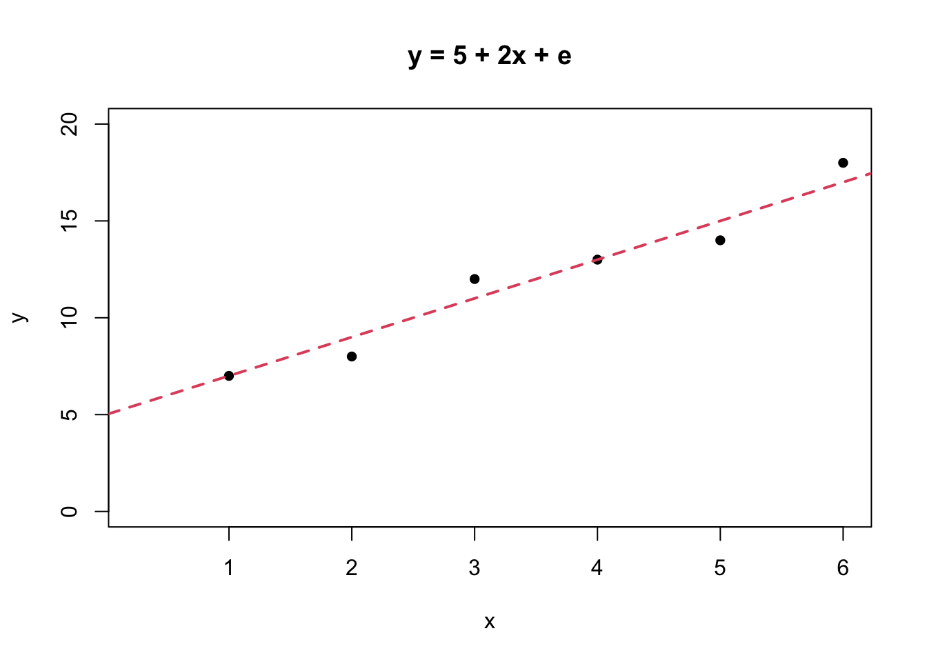
The straight-line relationship obtained by this process is \[\hat{Y} = 5 + 2*X\].
Note, \(\hat{Y}\) is a notation for the value of \(Y\) as predicted by the straight-line relationship.
We can add more information about the predicted values of \(Y\) by the “estimated” model to our table, so that we have
| X | Y | \(\hat{Y}\) | \({Y - \hat{Y}}\) |
|---|---|---|---|
| 1 | 7 | 7.00 | 0.00 |
| 2 | 8 | 9.00 | -1.00 |
| 3 | 12 | 11.00 | 1.00 |
| 4 | 13 | 13.00 | 0.00 |
| 5 | 14 | 15.00 | -1.00 |
| 6 | 18 | 17.00 | 1.00 |
Looking at the information contained in the previous plot, the column headed \(\hat{Y}\) contains the predicted values of \(Y\) for the values of \(X\). For example, the first value of \(\hat{Y}\) is when \(X = 1\) and \(Yp = 5 + 2*X\) so \(\hat{Y} = 5 +2*1 = 7\). The column headed \((Y - \hat{Y})\) is the difference between the actual value and the value predicted by the line. For example when \(X = 1\), \(Y = 7\) and \(\hat{Y} = 7\) so the predicted value lies on the line, as can be seen in the graph. For the value \(X = 2\) the actual value lies \(1\) unit below the line, as can also be seen from the graph.
The column \((Y - \hat{Y})\) measures the disagreement between the actual data and the line and a sensible strategy is to make this level of disagreement as small as possible. Referring to the graph on the table above notice that sometimes the actual data value is below the line and sometimes it is above the line, so on average the value will be close to zero. In this particular example the sum of the \((Y - \hat{Y})\) values add up to zero (in a more conventional notation \(\Sigma(Y - \hat{Y}) = 0\)). The quantity \(\Sigma(Y - \hat{Y})\) does not seem to be a satisfactory measure of disagreement, because there are a number of different lines with the property \(\Sigma(Y - \hat{Y}) = 0\).
A way of obtaining a satisfactory measure of disagreement is to square the individual \((Y - \hat{Y})\) values and add them up. i.e. obtain the quantity \(\Sigma(Y - \hat{Y})^2\). The result is always a positive number since the square of a negative number is positive. If this quantity is then chosen to be as small as possible then the level of disagreement between the actual data points and the fitted line is the least. This provides a criterion for the choice of the best line.
The quantity \(\Sigma(Y - \hat{Y})^2\) can be easily calculated and added to our table
| X | Y | \(\hat{Y}\) | \({Y - \hat{Y}}\) | \((Y - \hat{Y})^2\) |
|---|---|---|---|---|
| 1 | 7 | 7.00 | 0.00 | 0 |
| 2 | 8 | 9.00 | -1.00 | 1 |
| 3 | 12 | 11.00 | 1.00 | 1 |
| 4 | 13 | 13.00 | 0.00 | 0 |
| 5 | 14 | 15.00 | -1.00 | 1 |
| 6 | 18 | 17.00 | 1.00 | 1 |
The quantity \(\Sigma(Y - \hat{Y})^2\) is a measure of the disagreement between the actual \(Y\) values and the values predicted by the line. If this value is chosen to be as small as possible then the disagreement between the actual Y values and the line is the smallest it could possibly be, hence the line is The line of Best Fit.
This procedure of finding the intercept and the gradient of a line that makes the quantity \(\Sigma(Y - \hat{Y})^2\) a minimum is called The Method of Least Squares.
The Method of Least Squares was developed by K. F Gauss (1777 - 1855) a German mathematician, Gauss originated the ideas and a Russian mathematician A. A. Markov (1856 - 1922) developed the method.
In R we use the lm( ) function to fit linear models as illustrated below.
x <- c(1:6)
y <- c(7, 8, 12, 13, 14, 18)
plot(x, y, pch = 16, main = "y = f(x) + e", xlim = c(0.25, 6), ylim = c(0, 20))
abline(lm(y~x), lwd = 2, lty = 2, col = 2)
The final issue is to find out how to measure the three quantities:
- The Total Variation in \(Y\)
- The Explained Variation
- The Unexplained Variation
Taking these quantities one at a time they can be measured as follows:
The Unexplained Variation
This turns out to be very simple to measure. The quantity: \(\Sigma(Y - \hat{Y})^2\) is a measure of the Unexplained Variation. If the line were a perfect fit to the data, the value predicted by the line and the actual value would be exactly the same and the value of the quantity \(\Sigma(Y - \hat{Y})^2\) would be zero. This quantity is a measure of the disagreement between the actual \(Y\) values and the predicted values \(\hat{Y}\), which are also known as the residuals and are measuring the Unexplained Variation in \(Y\). For the example used above the value of \(\Sigma(Y - \hat{Y})^2\) is \(3.77\).
The Total Variation in Y
This is related to the measures of variability (spread) introduced earlier in the course and in particular to the standard deviation (\(\sigma\)). To measure The Total Variation in Y requires a measure of spread.
The Total Variation in Y is defined to be the quantity: \(\Sigma(Y - \bar{Y})^2\) Where \(\bar{Y}\) is the average value of \(Y\) (\(\bar{Y} = \Sigma(Y)/n\)).
In our earlier example \(\bar{Y} = 12\), so we can expand the table to include this calculation
| X | Y | \(\hat{Y}\) | \({Y - \hat{Y}}\) | \((Y - \hat{Y})^2\) | \(\Sigma(Y - \bar{Y})^2\) |
|---|---|---|---|---|---|
| 1 | 7 | 7.00 | 0.00 | 0 | 25.00 |
| 2 | 8 | 9.00 | -1.00 | 1 | 16.00 |
| 3 | 12 | 11.00 | 1.00 | 1 | 0.00 |
| 4 | 13 | 13.00 | 0.00 | 0 | 1.00 |
| 5 | 14 | 15.00 | -1.00 | 1 | 4.00 |
| 6 | 18 | 17.00 | 1.00 | 1 | 36.00 |
giving \(\Sigma(Y - \bar{Y})^2 = 82\).
The Explained Variation in Y
If the line was a perfect fit, then the \(Y\) values and the \(\hat{Y}\) values would be exactly the same, and the quantity \((\hat{Y} - \bar{Y})^2\) would measure The Total Variation in Y. If the line is not a perfect match to the actual \(Y\) values then this quantity measures The Explained Variation in Y.
| X | Y | \(\hat{Y}\) | \({Y - \hat{Y}}\) | \((Y - \hat{Y})^2\) | \(\Sigma(Y - \bar{Y})^2\) | \((\hat{Y} - \bar{Y})^2\) |
|---|---|---|---|---|---|---|
| 1 | 7 | 7.00 | 0.00 | 0 | 25.00 | 27.94 |
| 2 | 8 | 9.00 | -1.00 | 1 | 16.00 | 10.06 |
| 3 | 12 | 11.00 | 1.00 | 1 | 0.00 | 1.12 |
| 4 | 13 | 13.00 | 0.00 | 0 | 1.00 | 1.12 |
| 5 | 14 | 15.00 | -1.00 | 1 | 4.00 | 10.06 |
| 6 | 18 | 17.00 | 1.00 | 1 | 36.00 | 27.94 |
incorporating this calculation into the table above will enable us to get \((\hat{Y} - \bar{Y})^2 = 78.23\).
Correlation does not imply causation
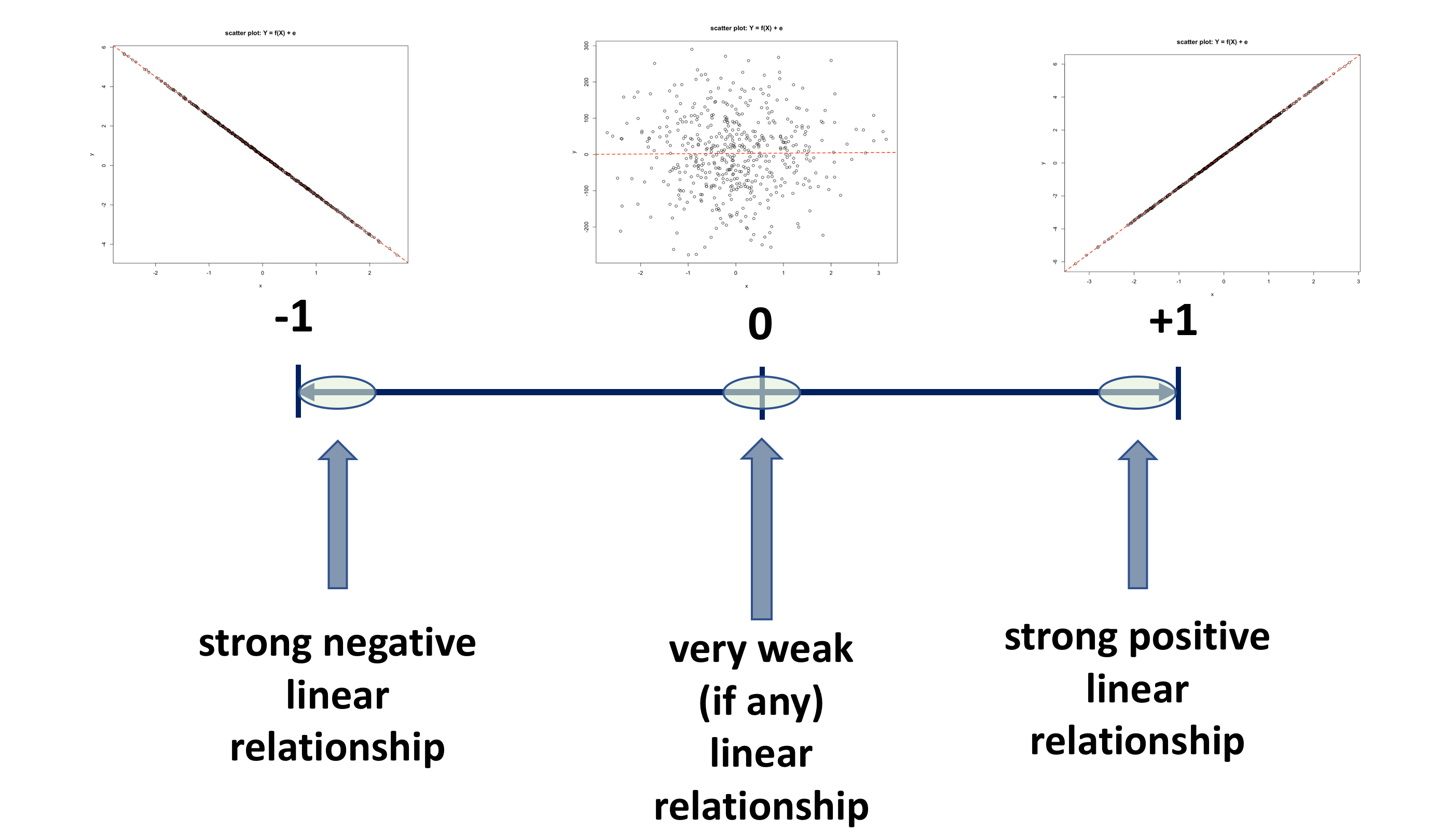
Once the intercept and slope have been estimated using the method of least squares, various indices are studied to determine the reliability of these estimates. One of the most popular of these reliability indices is the correlation coefficient. A sample correlation coefficient, more specifically known as the Pearson Product Moment correlation coefficient, denoted \(r\), has possible values between \(-1\) and \(+1\), as illustrated in the diagram below.
In fact, the correlation is a parameter of the bivariate normal distribution, that is used to describe the association between two variables, which does not include a cause and effect statement. That is, one variable does not depend on the other, i.e. the variables are not labelled as dependent and independent. Rather, they are considered as two random variables that seem to vary together. Hence, it is important to recognise that correlation does not imply causation. In correlation analysis, both \(Y\) and \(X\) are assumed to be random variables, whiles in linear regression, \(Y\) is assumed to be a random variable and \(X\) is assumed to be a fixed variable.
Main characteristic of the correlation coefficient \(r\) are:
- there are no units for the correlation coefficient
- it lies between \(-1 \leqslant r \leqslant 1\)
- when its value is near -1 or +1 it shows a strong linear association
- a correlation coefficient of -1 or +1 indicates a perfect linear association
- value near 0 suggests no relationship
- the sign of the correlation coefficient indicates the directions of the association
- a positive \(r\) is associated with an estimated positive slope
- a negative \(r\) is associated with an estimated negative slope
BUT!!!
- \(r\) is a measure of the strength of a linear association and it should not be used when the relationship is non-linear, therefore \(r\) is NOT used to measure strength of a curved line
- \(r\) is sensitive to outliers
- \(r\) does not make a distinction between the response variable and the explanatory variable. That is, the correlation of \(X\) with \(Y\) is the same as the correlation of \(Y\) with \(X\).
- in simple linear regression, squaring the correlation coefficient, \(r^2\), results in the value of the coefficient of determination \(R^2\)
The Spearman rank correlation coefficient is an corresponding nonparametric equivalent of the Pearson correlation coefficient. This statistic is computed by replacing the data values with their ranks and pplying the Pearson correlation formula to the ranks of the data. Tied values are replaced with the average rank of the ties. Just like in the case of Pearson coefficient, this one is also really a measure of association rather than correlation, since the ranks are unchanged by a monotonic transformation of the original data. For the sample sizes greater than 10, the distribution of the Spearman rank correlation coefficient can be approximated by the distribution of the Pearson correlation coefficient. It is also worth knowing that the Spearman rank correlation coefficient uses the weights when weights are specified.
The coefficient of Determination \(R^2\)
We realise that when fitting a regression model we are seeking to find out how much variance is explained, or is accounted for, by the explanatory variable \(X\) in an outcome variable \(Y\).
In the earlier example above the following has been calculated:
- \(\text{The Total Variation in }\)\(Y = 82.00\)
- \(\text{The Explained Variation in }\)\(Y = 78.23\)
- \(\text{The Unexplained Variation in }\)\(Y = 3.77\)
Notice the relationship given below, is satisfied
\[\text{The Total Variation in Y = Explained Variation + Unexplained Variation}\]
\[82.00 = 78.23 + 3.77\] What do these quantities tell us? They are difficult to interpret because they are expressed in the units of the problem.
Consider the following ratio:
\({\text{The Explained Variation in Y} \over \text{The Total Variation in Y}} = {78.23 \over 82.00} = 0.954\)
This is saying that \(0.954\) or \(95.4\%\) of the changes in \(Y\) are explained by changes in \(X\). This is a useful and useable measure of the effectiveness of the match between the actual \(Y\) values and the predicted \(Y\) values.
Reviewing the five scatter prolos (Graphs 1 to 5) it can easily be seen that if the line is a perfect fit to the actual \(Y\) values as in Graphs 1 & 5 then this ratio will have the value \(1\) or \(100\%\).
If there is no link between \(Y\) and \(X\) then the The Explained Variation is zero hence the ratio will be \(0\) or \(0\%\). An example of this is shown in Graph 3.
The remaining graphs: Graphs 2 & 4 show a statistical relationship hence this ratio will lie between \(0\) & \(1\). The closer the ratio is to zero the less strong the link is, whilst the closer the ratio is to \(1\) the stronger the connection is between \(X\) & \(Y\).
The Ratio:
\[R^2 = {\text{The Explained Variation in Y} \over \text{The Total Variation in Y}}\]
is called the Coefficient of Determination, and usually labelled as \(R^2\), and may be defined as the proportion of the changes in \(Y\) explained by changes in \(X\).
This ratio is always on the scale \(0\) to \(1\), but by convention is usually expressed as a percentage, so is regarded as on the scale \(0\) to \(100\%\). The interpretation of this ratio is as follows:
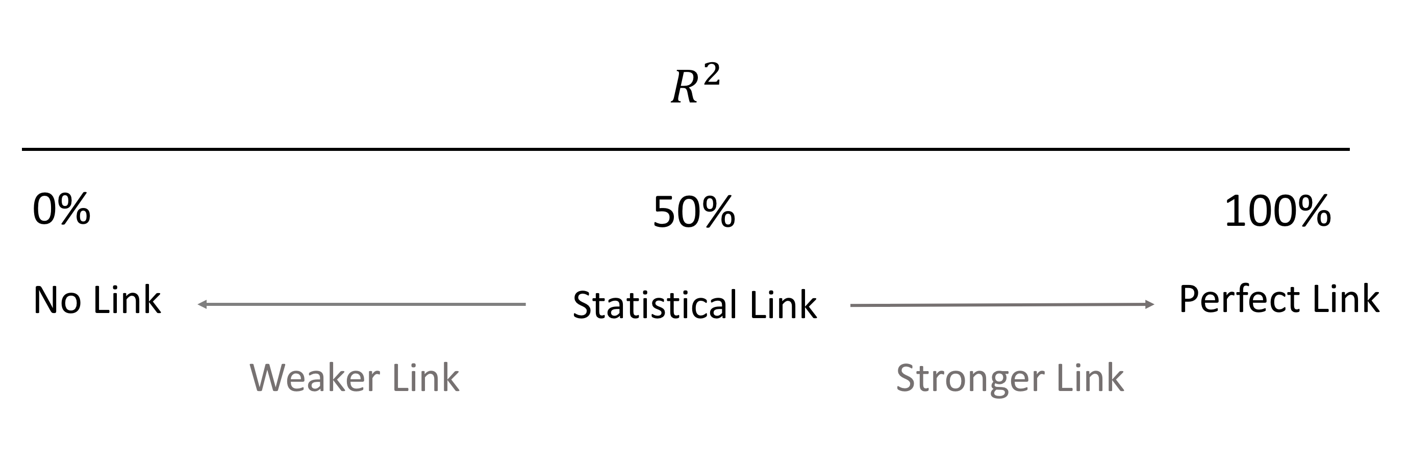
The theoretical minimum \(R^2\) is \(0\). However, since linear regression is based on the best possible fit, \(R^2\) will always be greater than zero, even when the predictor and outcome variables bear no relationship to one another. The definition and interpretation of \(R^2\) is a very important tool in the data analyst’s tool kit for tracking connections between a measured response variable and a measured explanatory variable.
Using Sample Data to Track a connection
When working with sample data to investigate any relationships that may exist between a measured response variable and a measured explanatory variable, the information contained within the sample is imperfect, so has to be interpreted in the light of sampling error. This is particularly important when interpreting the value of \(R^2\) calculated from sample data. The sample R2 value gives a measure of the strength of the connection, and this can sometimes be difficult to interpret particularly if the sample size is small.
The data analysis methodology as set out earlier, is a procedure that enables you to make judgements from sample data. The methodology requires you to know what specific procedures make up the Initial Data Analysis IDA and how to interpret the results of the IDA to obtain one of three outcomes:
- No evidence of a connection between the response and the explanatory variable
- Clear evidence of a connection between the response and the explanatory variable
- The IDA is inconclusive and further analysis is required
If Further Data Analysis, FDA, is required then you need to know what constitutes this further analysis and how to interpret it.
Finally, if a connection between the response variable and the explanatory variable is detected then a description of the connection is required. In this case the connection needs to be described.
To demonstrate the data analysis methodology we’ll go back to Share Price Study Case Study.
Share Price Study Data
A business analyst is studying share prices of companies from three different business sectors. As part of the study a random sample (n=60) of companies was selected and the following data was collected:
| Variable | Description |
|---|---|
| Share_Price | The market value of a company share (£) |
| Profit | Company annual profit (£1.000.000) |
| RD | Company annual spending on research and development (£1.000) |
| Turnover | Company annual total revenue (£1.000.000) |
| Competition | A variable coded: |
| - 0 if the company operates in a very competitive market | |
| - 1 if the company has a great deal of monopoly power | |
| Sector | A variable coded: |
| - 1 if the company operates in the IT business sector | |
| - 2 if the company operates in the Finance business sector | |
| - 3 if the company operates in the Pharmaceutical business sector | |
| Type | A variable coded: |
| - 0 if the company does business mainly in Europe | |
| - 1 if the company trades globally |
Let’s start off by investigating the relationship between the variables Share_Price and Profit.
We will adopt the following notation
- \(Y: Share\_Price\)
- \(X: Profit\)
\(\text{Model to be estimated: } Y = b_0 + b_1X + e\)
We start by accessing data:
suppressPackageStartupMessages(library(dplyr))
# read csv file
companyd <- read.csv("https://tanjakec.github.io/mydata/SHARE_PRICE.csv", header=T)
# look at the data
glimpse(companyd)
## Rows: 60
## Columns: 7
## $ Share_Price <int> 880, 862, 850, 840, 838, 825, 808, 806, 801, 799, 783, 77…
## $ Profit <dbl> 161.3, 170.5, 140.7, 115.7, 107.9, 138.8, 102.0, 102.7, 1…
## $ RD <dbl> 152.6, 118.3, 110.6, 87.2, 75.1, 116.2, 91.3, 100.4, 113.…
## $ Turnover <dbl> 320.9, 306.3, 279.5, 193.2, 182.4, 265.2, 212.0, 170.3, 2…
## $ Competition <int> 1, 1, 1, 1, 1, 1, 1, 1, 1, 1, 1, 0, 0, 0, 1, 1, 0, 0, 1, …
## $ Sector <int> 3, 3, 3, 3, 3, 3, 3, 3, 3, 2, 2, 2, 2, 2, 2, 3, 3, 3, 3, …
## $ Type <int> 0, 0, 0, 0, 0, 1, 1, 1, 1, 0, 0, 0, 1, 1, 1, 1, 1, 1, 1, …# convert into factore type variables
companyd[, 5] <- as.factor(companyd[, 5])
companyd[, 6] <- as.factor(companyd[, 6])
companyd[, 7] <- as.factor(companyd[, 7])
# glance at data
summary(companyd)## Share_Price Profit RD Turnover Competition
## Min. :101.0 Min. : 2.90 Min. : 39.20 Min. : 30.3 0:30
## 1st Qu.:501.2 1st Qu.: 59.73 1st Qu.: 75.78 1st Qu.:112.3 1:30
## Median :598.5 Median : 88.85 Median : 90.60 Median :173.5
## Mean :602.8 Mean : 84.76 Mean : 89.64 Mean :170.2
## 3rd Qu.:739.8 3rd Qu.:106.62 3rd Qu.:104.15 3rd Qu.:216.6
## Max. :880.0 Max. :170.50 Max. :152.60 Max. :323.3
## Sector Type
## 1:20 0:30
## 2:20 1:30
## 3:20
##
##
## glimpse(companyd)## Rows: 60
## Columns: 7
## $ Share_Price <int> 880, 862, 850, 840, 838, 825, 808, 806, 801, 799, 783, 77…
## $ Profit <dbl> 161.3, 170.5, 140.7, 115.7, 107.9, 138.8, 102.0, 102.7, 1…
## $ RD <dbl> 152.6, 118.3, 110.6, 87.2, 75.1, 116.2, 91.3, 100.4, 113.…
## $ Turnover <dbl> 320.9, 306.3, 279.5, 193.2, 182.4, 265.2, 212.0, 170.3, 2…
## $ Competition <fct> 1, 1, 1, 1, 1, 1, 1, 1, 1, 1, 1, 0, 0, 0, 1, 1, 0, 0, 1, …
## $ Sector <fct> 3, 3, 3, 3, 3, 3, 3, 3, 3, 2, 2, 2, 2, 2, 2, 3, 3, 3, 3, …
## $ Type <fct> 0, 0, 0, 0, 0, 1, 1, 1, 1, 0, 0, 0, 1, 1, 1, 1, 1, 1, 1, …The Initial Data Analysis for investigating a connection between a measured response and a measured explanatory variable requires obtaining a graph of the response against the explanatory variable and to calculate the value of \(R^2\) from the sample data.
The IDA has three possible outcomes:
- No evidence of a connection between the response and the explanatory variable.
- Clear evidence of a connection between the response and the explanatory variable.
- The IDA is inconclusive and further analysis is required.
The simplest form of connection is a straight-line relationship and the question arises could a straight-line relationship be matched with the information contained in the Graphs 1 to 5 discussed earlier?

As part of an informal investigation of the possible relationship between Share_Price and Profit, first we will use R to obtain a scatter plot with the line of the best fit. Rather than every time referring to the name of the data set containing the variables of interest, we will attach our data and refer to the variables directly using only their names (see help for the attach( ) function).
attach(companyd)
names(companyd) # shows the names of the variables in the 'companyd' data frame
## [1] "Share_Price" "Profit" "RD" "Turnover" "Competition"
## [6] "Sector" "Type"plot(Share_Price ~ Profit, cex = .6, main = "Share Price = f(Profit) + e")
abline(lm(Share_Price ~ Profit), lty = 2, col = 2)
Let’s go through the code and the functions we have used to produce this graph.
The
plot( )function gives a scatterplot of two numerical variables. The first variable listed will be plotted on the horizontal axis and the second on the vertical axis, i.e. you ‘feed’ as the arguments first variable representing X and then variable representing Y:plot( x, y). Considering that we are investigating a relationship between \(X\) and \(Y\) in the form of a regression line \(Y = b_0 + b1_X + e\), we specify that in R as a formulaY ~ X, which can be read as “\(Y\) is modelled as a function of \(X\)”. This means that in the R’splot( )function a formula interface can also be used, in which case the response variable \(Y\) needs to come before the tilde (\(\sim\)) and \(X\) variable that will be plotted on the horizontal axis.Next, we fit a line of the best-fit through our scatterplot using the
abline( )function for the linear model \(Y = b_0 + b_1X\) to see how close are the points to the fitted line. The basic R function for fitting linear models by ordinary least squares is thelm( ), which stands for linear model. All we need to feed R with when using thelm( )function is the formulaY~X.
The scatterplot shows a fairly strong and reasonably linear relationship between the two variables. In other words, the fit is reasonably good, but it is not perfect and we could do with some more information about it. Let us see what the lm( ) function provide as a part of the output.
lm(Share_Price ~ Profit)##
## Call:
## lm(formula = Share_Price ~ Profit)
##
## Coefficients:
## (Intercept) Profit
## 258.924 4.057First, R displays the fitted model, after which it shows the estimates of the two parameters \(b_0\) & \(b_1\) to which it refers to as coefficients.
- the intercept, \(b_0 = 258.924\)
- the slope, \(b_1= 4.057\)
We must now take this estimated model and ask a series of questions to decide whether or not our estimated model is good/bad: that is, we have to subject the fitted model to a set of tests designed to check the validity of the model, which is in effect a test of your, as a modeller, viewpoint/theory.
Examining the scatterplot, we can see that not all of the points lie on the fitted line \(Share\_Price = 258.924 + 4.057Profit\). To explain how strong the relationship is between the two variables we need to obtain the coefficient of determination known as the \(R^2\) parameter.
The coefficient of determination, \(R^2\), is a single number that measures the extent to which the explanatory variable can explain, or account for, the variability in \(Y\) – that is, how well does the explanatory variable explain the variability in, or behaviour of, the phenomenon we are trying to understand.
Earlier, we saw that \(R^2\) is constrained to lie in the following range:
\[0\% \text{ <---------- } R^2 \text{ ----------> } 100\%\]
We realised that the closer \(R^2\) is to \(100\%\) then the better the model is, and conversely, a value of \(R^2\) close to \(0\%\) implies a weak/poor model.
To obtain all of the information about the fitted model we can use the summary( ) function as in the following:
summary(lm(Share_Price ~ Profit))##
## Call:
## lm(formula = Share_Price ~ Profit)
##
## Residuals:
## Min 1Q Median 3Q Max
## -175.513 -74.826 0.107 67.824 141.358
##
## Coefficients:
## Estimate Std. Error t value Pr(>|t|)
## (Intercept) 258.9243 28.7465 9.007 1.29e-12 ***
## Profit 4.0567 0.3102 13.077 < 2e-16 ***
## ---
## Signif. codes: 0 '***' 0.001 '**' 0.01 '*' 0.05 '.' 0.1 ' ' 1
##
## Residual standard error: 89.98 on 58 degrees of freedom
## Multiple R-squared: 0.7467, Adjusted R-squared: 0.7424
## F-statistic: 171 on 1 and 58 DF, p-value: < 2.2e-16So, what have we got here? 🤔
We will discuss some of the key components of R’s summary( ) function for linear regression models.
- Call: shows what function and variables were used to create the model.
- Residuals: difference between what the model predicted and the actual value of Y. Try to see if you can calculate this ‘residuals’ section by yourself using:
summary(Y-model$fitted.values). 🤓- Coefficients:
- estimated parameters for intercept and slope: \(b_0\) and \(b_1\)
- Std. Error is Residual Standard Error divided by the square root of the sum of the square of that particular explanatory variable.
- t value: Estimate divided by Std. Error
- Pr(>|t|): is the value in a t distribution table with the given degrees of freedom.
Note that in the first section we can find statistics relevant to the estimation of the model’s parameters. In the second part of the output we can find statistics related to the overall goodness of the fitted model.
The
summary(lm( ))produces the standard deviation of the error. We know that standard deviation is the square root of variance. Standard Error is very similar, the only difference is that instead of dividing by \(n-1\), you subtract \(n\) minus \(1 + k\), where \(k\) is the number of explanatory variables used in the model. See if you can use and adjust the code below to calculate this statistic. 🤓# Residual Standard Error k <- length(model$coefficients) - 1 #Subtract one to ignore intercept SSE <- sum(model$residuals^2) n <- length(model$residuals) sqrt(SSE / (n-(1+k)) ) # Residual Standard ErrorNext is the coefficient of determination, which helps us determine how well the model fits to the data. We have already seen that \(R^2\) subtracts the residual error from the variance in Y. The bigger the error, the worse the remaining variance will appear.
For the time being we will skip \(R^2_{adjusted}\) and point out that it is used for models with multiple variables, to which you will be introduced in the next section.
Lastly, the F-Statistic is the second “test” that the summary function produces for
lmmodels. The F-Statistic is a “global” test that checks if at least one of your coefficients are nonzero, i.e. when dealing with a simple regression model to check if the model is worthy of further investigation and interpretation.
Model Interpretation:
To go back to our model interpretation. Earlier, we said after examining the scatter plot that there is a a clear link between Share_Price and Profit. This is confirmed by the value of \(R^2 = 74.67\%\). The interpretation of \(R^2\) is suggesting that \(74.67\%\) of the changes in Share_Price are explained by changes in Profit. Alternatively, \(25.33\%\) of the changes in Share_Price are due to other variables.
For this example the outcome of the IDA is that there is clear evidence of a link between Share_Price and Profit and the nature of the influence being that as Profit increases Share_Price also increases. It only remains to describe the connection, and discuss how effective the model is, and ask if it can be used to predict Share_Price value from the value of Profit? 🤔
Further Data Analysis
The adequacy of \(R^2\) can be judged both informally and formally using hypothesis testing. Like all hypothesis tests, this test is carried out in four stages:
- Specify the hypotheses
- Define the test parameters and decision rule
- Examine the sample evidence
- Conclusions
Stage 1: Specify the hypotheses (\(H_0\) & \(H_1\)).
The Coefficient of Determination \(R^2\) is a useful quantity. By definition if \(R^2 = 0\) then there is no connection between the response variable and the explanatory variable. Conversely if the value of \(R^2\) is greater than zero there must be a connection. This enables the formal hypotheses to be defined as:
- \(H_0 : R^2 = 0\) (There is no relationship between the response and interest and the explanatory variable.)
- \(H_1 : R^2 > 0\) (There is a relationship between the response and the explanatory variable.)
Stage 2: Defining the test parameters and the decision rule.
The decision rule is based on the F statistic. The F distribution has a shape as shown below:
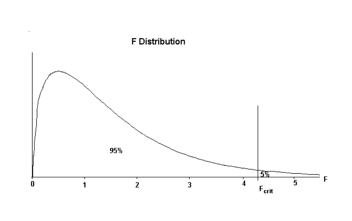
The value of \(F_{crit}\) is the value that divides the distribution with \(95\%\) of the area to the left of the \(F_{crit}\) ordinate, and \(5\%\) to the right. The accepted terminology is \(F_{crit}\) but this text will call this quantity \(F_{calc}\) to signify it is a quantity obtained from statistical tables.
The decision rule is:
If the value of \(F_{calc}\) from the sample data is larger than \(F_{crit}\), then the sample evidence favours the decision that there is a connection between the response variable and the explanatory variable. (i.e. favours \(H_1\).)
If the value of \(F_{calc}\) is smaller than \(F_{crit}\) then the sample evidence is consistent with no connection between the response variable and the explanatory variable. (i.e. favours \(H_0\))
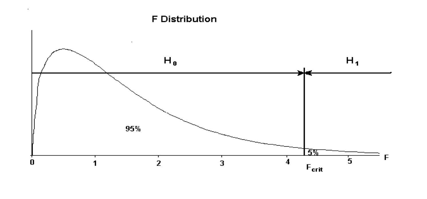
The decision rule can be summarised as:
If \(F_{calc} < F_{crit}\) then favour \(H_0\), whilst if \(F_{calc} > F_{crit}\) then favour \(H_1\). This decision rule can be represented graphically as below:
The decision rule maybe written as:
- If \(F_{calc} < F_{crit}\) then accept \(H_0\)
- If \(F_{calc} > F_{crit}\) then accept \(H_1\)
The value of \(F_{crit}\) depends on the amount of data in the sample. The Degrees of Freedom (usually abbreviated to \(df\)) express this dependence on the sample size. For any given set of sample data, having obtained the \(df\) the specific value of \(F_{crit}\) can be obtained from Statistical Tables of the F distribution, or simply by using the qf(p, df1, df2) function in R.
Stage 3: Examining the sample evidence
For the investigation of the Share_Price vs Profit we plot the scatterplot and obtain the summary of the fitted model: \(Share\_Price = b_0 + b_1Profit\)
# create a scatterplot
plot(Share_Price ~ Profit, cex = .6, main = "Share Price = f(Profit) + e")
# fit the model
model_1 <- lm(Share_Price ~ Profit)
# add the line of the best fit on the scatterplot
abline(model_1, lty = 2, col = 2)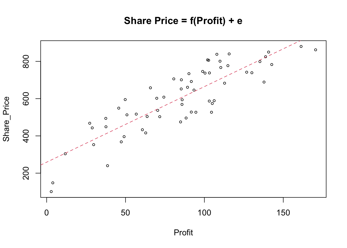
# obtain R_sq of the fitted model
summary(model_1)$r.squared
## [1] 0.7467388This is a good model explaining almost \(3/4\) of the overall variability in the explanatory variable \(Y\). Hence, based on the sample evidence, variable Profit, can explain \(74.67\%\) of overall variation in the variable Share_Price.
Note, that if we don’t reject that there is a relationship between the two variables we will obtain full output of the summary(lm(model_1)) function regardless of the need for FDA. If we conclude that there is a clear relationship, we will need the estimates of the parameters to describe it, and if we need further to investigate the significance of the relationship we need relevant statistics for conducting the FDA.
In the cases where \(R^2 \approx 0\) we will carry out a hypothesis test for which we need \(F_{calc}\) from the summary( ) function.
Let us assume that the \(R^2\) for the given example Share_Price vs Profit is very small and close to zero. In that case, we cannot simply reject it as a statistically insignificant relationship, as \(R^2\) is not zero, but neither can we with confidence accept it as a statistically valid relationship based on the sample evidence we use.
This step requires the calculation of the \(F_{calc}\) value from the sample data, and the determining of the degrees of freedom.
summary(model_1)##
## Call:
## lm(formula = Share_Price ~ Profit)
##
## Residuals:
## Min 1Q Median 3Q Max
## -175.513 -74.826 0.107 67.824 141.358
##
## Coefficients:
## Estimate Std. Error t value Pr(>|t|)
## (Intercept) 258.9243 28.7465 9.007 1.29e-12 ***
## Profit 4.0567 0.3102 13.077 < 2e-16 ***
## ---
## Signif. codes: 0 '***' 0.001 '**' 0.01 '*' 0.05 '.' 0.1 ' ' 1
##
## Residual standard error: 89.98 on 58 degrees of freedom
## Multiple R-squared: 0.7467, Adjusted R-squared: 0.7424
## F-statistic: 171 on 1 and 58 DF, p-value: < 2.2e-16Stage 4: Conclusion
The associated F statistic evaluating the significance of the full model \(F_{calc} = 171\) with \(df_1=1\) and \(df_2=58\). Thus,
F_crit <- qf(0.95, 1, 58)
F_crit
## [1] 4.006873\(F_{crit} = 4.01\) and using the decision rule given, we get that
\[F_{calc}=171 > F_{crit}=4.01\text{ => accept }H_1\] , ie this model is statistically significant and we need to describe it.
Describe the Relationship
If the resulting outcome from either the Initial Data Analysis (IDA) or the Further Data Analysis (FDA) is that there is a connection between the response variable and the explanatory variable then the last step is to describe this connection.
For the data analysis situation Measured v Measured this is simply stating the line of the best fit. This is a description of the connection between the two variables. Additionally the \(R^2\) value should be quoted as this gives a measure of how well the data and the line of best fit match.
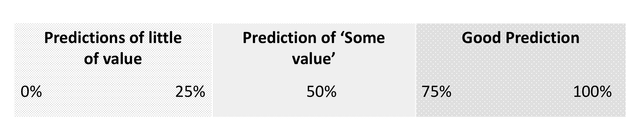
The \(R^2\) value can be interpreted as a measure of the quality of predictions made from the line of best fit according to the rule of thumb:
In our example Share_Price vs Profit we had the following estimations:
- \(b_0 = 258.9243\)
- \(b_1 = 4.0567\)
\[Share\_Price = 258.9243 + 4.0567 Profit\]
with \(R^2 = 74.67\%\).
Making predictions
Can the regression line be used to make predictions about the Share_Price for a company with a given value of the Profit?
Suppose we have to make a prediction of the \(Share\_{Price}\) for company with the \(Profit = 137.2\)
The predictions are calculated from the model as follows:
\[Share\_Price = 258.9243 + 4.0567 \times 137.2000 = 815.5035\] Since the \(R^2\) value is nearly \(75\%\) any predictions about Share_Price made from this model are likely to be of good quality, but there may be some issues with some of these predictions of the Profit values out of the data range used in prediction. The Profit in the given data set range from about \(3\) to \(170\). Over this range any prediction is likely to be of good quality since the information in the data is reflecting experience within this range, and the \(R^2\) value is nearly \(75\%\).
summary(Profit)## Min. 1st Qu. Median Mean 3rd Qu. Max.
## 2.90 59.73 88.85 84.76 106.62 170.50The Share_Price for the company with the Profit that lies outside the range of experience is not likely to be very reliable, or of much value. These problems are caused by the fact that the information available about the link between Share_Price and Profit is only valid over the range of values that Profit takes in the data. There is no information about the nature of the connection outside this range and any predictions made must be treated with caution.
In general terms when interpreting a regression model the intercept is of little value, since it is generally out of the range of the data. The gradient term is the more important and the formal definition of the gradient provides the interpretation of this information.
The gradient is defined to be the change in \(Y\) for a unit increase in \(X\). For the model developed the gradient is \(4.06\). This is suggesting for every additional unit increase in Profit, Share_Price increases by \(£4.06\).
Avoid extrapolation! Refrain from predicting/interpreting the regression line for X-values outside the range of X in the data set!
YOUR TURN 👇
Investigate the nature of the relationship in Share Price Study data for
Share_Price vs RDandShare_Price vs Turnover.Download The Supermarket data set available at https://github.com/TanjaKec/mydata using the following link https://tanjakec.github.io/mydata/SUPERM.csv.
Crate an Rmd report in which you will:
- Give a brief explanation of the following statistical terms:
- Response Variable
- Explanatory variable
- Measured Variable
- Attribute Variable
- Provide a brief answer for each of the following questions:
- What is ‘Data Analysis Methodology’, and why is this needed when working with sample data?
- What are the statistical concepts used to investigate the relationship between a measured response variable and an attribute explanatory variable?
- What are the statistical concepts used to investigate the relationship between a measured response variable and a measured explanatory variable?
- Undertake the Data Analysis for the Supermarket Data Set to investigate the relationships between the response variable and from your point of view regarded as worth of attention set of explanatory variables. Present your points of views about the nature of the relationships and give a complete explanation, within the data analysis methodology, of this analysis.
You are expected to bring your report to into the next class.
© 2020 Tatjana Kecojevic