t-test & one-way ANOVA
Measured Response Variable vs Attribute Explanatory Variable
There are many cases where this data analysis situation is applicable. For example, if you would like to investigate if there is a gender pay gap in an organisation or if a chemical engineer wants to compare the hardness of five blends of paint you would conduct MvsA DA to reach a conclusion.
The focus of investigation is the response variable for which we seek to describe its variability and its causes. We use the explanatory variable to explore if its behaviour influences the changes in the response variable, i.e. does the response variable respond to the changes in the explanatory variable? We seek to find out if the variability in the response variable can be explained by the explanatory variable.
As in this data analysis situation the focal point of our attention is the measured response variable, we focus on its distribution. Since we investigate the influence on its behaviours caused by the change in the attribute explanatory variable, we apply the following underlying concept:
There is a relationship between a measured response and an attribute explanatory variable if the average value of the response is dependent on the level of the attribute explanatory variable.
In the case of the measured response variable versus the attribute explanatory variable with two levels (M vs A(2)), this can be illustrated graphically by plotting the statistical distribution of the response variable for the two attribute levels as below:
There is no link:
Given a measured response and an attribute explanatory variable with two levels, red (attribute level 1) & blue (attribute level 2), if the statistical distribution of the response variable for attribute level 1 and attribute level 2 are exactly the same, then the level of the attribute variable has no influence on the value response, there is no relationship.
There is a link:
Given a measured response and an attribute explanatory variable with two levels, red (attribute level 1) & blue (attribute level 2), if the statistical distribution of the response variable for attribute level 1 and attribute level 2 have different means, then the level of the attribute variable does influence the response variable.
Illustrative Example:
Response Variable: Amount Spent on Clothes per month
Attribute Explanatory Variable: Gender (Male/Female)
If Males and Females have the same ‘spending on clothes’ characteristics then the average amounts spent monthly by Males and by Females should be the same.
If Male and Females have different ‘spending on clothes’ characteristics then the average amount spent monthly by Males and Females would be different.
The definition uses the concept of a statistical distribution and the idea that the total population can be split into two or more sub-populations according to the level of the attribute. (i.e. in the illustrative example a population of Males and a population of Females). Then comparing the distributions and asking are they the same (no relationship) or do they differ in the means (there is a relationship).
It is sufficient to require equal means for no connection and unequal means for a connection irrespective of the shape/structure of the distributions.
Working wih sample data
The concepts above provide a clear framework for analysis. Working with sample data, which by definition is imperfect information and subject to sampling error, makes working with sample data more problematical. The analyst needs to ask the key question “is the sample data providing evidence of a real connection or is it a consequence of sampling error?”
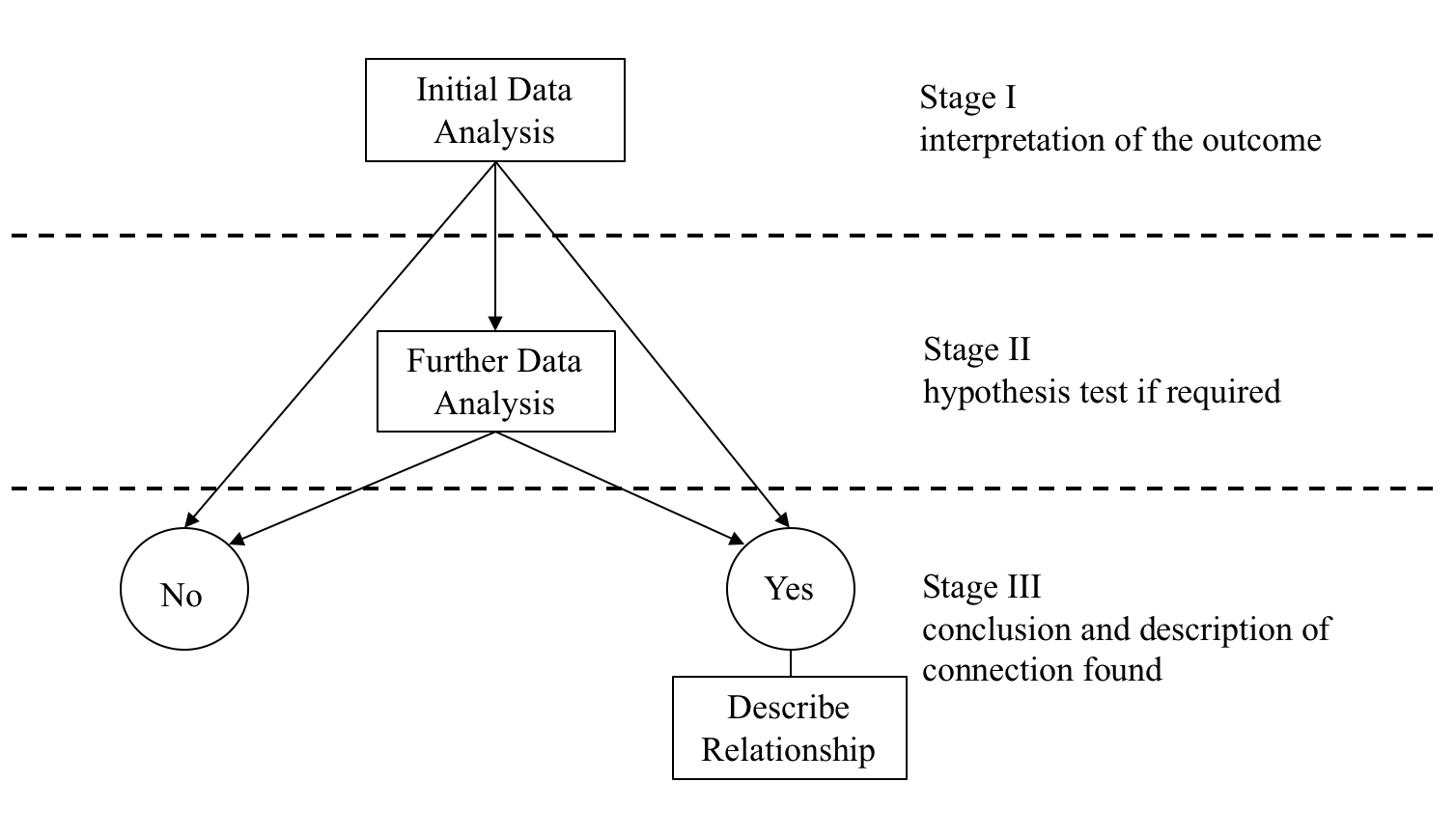
The common data analysis methodology introduced in the previous section provides a well defined methodology for working with sample data.
The basic question to be answered is: Is there a connection/link between the response variable and the explanatory variable?
This requires a definition of what is meant by connection/link.
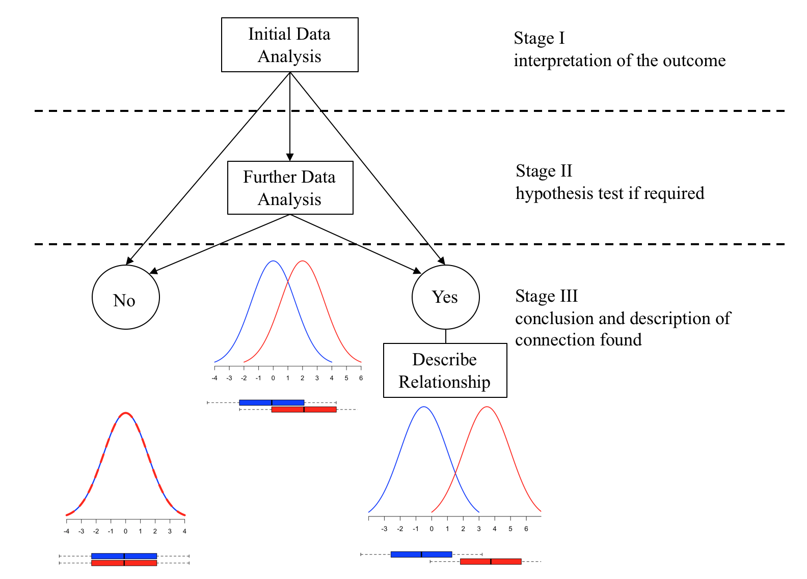
The Initial Data Analysis IDA is a set of simple descriptive procedures that enable the data analyst to make one of three judgements:
There is clearly no link between the response variable and the explanatory variable.
There is clearly a link between the response variable and the explanatory variable.
The sample evidence is unclear using these simple descriptive methods and more advanced methods are required to resolve the issue. In which case Further Data Analysis (FDA) is required.
The resulting conclusions from the further data analysis FDA can be one of two options:
The outcome of the analysis suggests that there is no connection/link/relationship between the response variable and the explanatory variable, and then the analysis is complete.
The outcome of the analysis suggests that the level of the explanatory variable influences the response variable, (i.e. there is a connection/link/relationship), then to complete the analysis the nature of the connection needs to be described.
To complete the data analysis the analyst needs to know how to perform the following three stages:

 -  What is the Initial Data analysis and how to interpret it
 -  How to perform the further data analysis if required
 -  How to describe the nature of any connection discovered.
The Initial Data Analysis
In general the Initial Data Analysis consists of constructing the mean value and a boxplot of the response variable for each level of the Attribute explanatory variable. Given a data sample the problem is how to construct the required means and boxplots.
Case Study: Share Price Study
Statistical data is usually organised as a table. Each row of the table represents an observation, whilst a column represents a variable.
A business analyst is studying share prices of companies from three different business sectors. As part of the study a random sample (n=60) of companies was selected and the following data was collected:
| Variable | Description |
|---|---|
| Share_Price | The market value of a company share (£) |
| Profit | The company annual profit (£1.000.000) |
| RD | Company annual spending on research and development (£1.000) |
| Turnover | Company annual total revenue (£1.000.000) |
| Competition | A variable coded: |
| - 0 if the company operates in a very competitive market | |
| - 1 if the company has a great deal of monopoly power | |
| Sector | A variable coded: |
| - 1 if the company operates in the IT business sector | |
| - 2 if the company operates in the Finance business sector | |
| - 3 if the company operates in the Pharmaceutical business sector | |
| Type | A variable coded: |
| - 0 if the company does business mainly in Europe | |
| - 1 if the company trades globally |
First, we need to access this data in R. We will start by creating a new project the ‘DAM’ within which we will keep all relevant scripts (.R), R-Markdown (.Rmd), data files and so on.
Go to File | New Project… | New Directory in the directory name box type in the suggested name of the project and tick the box open in new session. Click on the “Create Project” button. Open a new script:

and start coding.
Open the data:
suppressPackageStartupMessages(library(dplyr))
# read csv file
companyd <- read.csv("https://tanjakec.github.io/mydata/SHARE_PRICE.csv", header=T)
# have a look at the first few rows and the summary of data
head(companyd)
## Share_Price Profit RD Turnover Competition Sector Type
## 1 880 161.3 152.6 320.9 1 3 0
## 2 862 170.5 118.3 306.3 1 3 0
## 3 850 140.7 110.6 279.5 1 3 0
## 4 840 115.7 87.2 193.2 1 3 0
## 5 838 107.9 75.1 182.4 1 3 0
## 6 825 138.8 116.2 265.2 1 3 1# When applied to an object of class data.frame, the summary shows descriptive statistics (Mean, SD, etc.)
summary(companyd)## Share_Price Profit RD Turnover
## Min. :101.0 Min. : 2.90 Min. : 39.20 Min. : 30.3
## 1st Qu.:501.2 1st Qu.: 59.73 1st Qu.: 75.78 1st Qu.:112.3
## Median :598.5 Median : 88.85 Median : 90.60 Median :173.5
## Mean :602.8 Mean : 84.76 Mean : 89.64 Mean :170.2
## 3rd Qu.:739.8 3rd Qu.:106.62 3rd Qu.:104.15 3rd Qu.:216.6
## Max. :880.0 Max. :170.50 Max. :152.60 Max. :323.3
## Competition Sector Type
## Min. :0.0 Min. :1 Min. :0.0
## 1st Qu.:0.0 1st Qu.:1 1st Qu.:0.0
## Median :0.5 Median :2 Median :0.5
## Mean :0.5 Mean :2 Mean :0.5
## 3rd Qu.:1.0 3rd Qu.:3 3rd Qu.:1.0
## Max. :1.0 Max. :3 Max. :1.0glimpse(companyd)## Rows: 60
## Columns: 7
## $ Share_Price <int> 880, 862, 850, 840, 838, 825, 808, 806, 801, 799, 783, 77…
## $ Profit <dbl> 161.3, 170.5, 140.7, 115.7, 107.9, 138.8, 102.0, 102.7, 1…
## $ RD <dbl> 152.6, 118.3, 110.6, 87.2, 75.1, 116.2, 91.3, 100.4, 113.…
## $ Turnover <dbl> 320.9, 306.3, 279.5, 193.2, 182.4, 265.2, 212.0, 170.3, 2…
## $ Competition <int> 1, 1, 1, 1, 1, 1, 1, 1, 1, 1, 1, 0, 0, 0, 1, 1, 0, 0, 1, …
## $ Sector <int> 3, 3, 3, 3, 3, 3, 3, 3, 3, 2, 2, 2, 2, 2, 2, 3, 3, 3, 3, …
## $ Type <int> 0, 0, 0, 0, 0, 1, 1, 1, 1, 0, 0, 0, 1, 1, 1, 1, 1, 1, 1, …Does everything seem okay? Can you notice a problem?
The problem is that the variables: ‘Comparison’, ‘Sector’ and ‘Type’ are attribute variables and currently they have been recognised as integer type. To encode a measured variable as an attribute variable we can use function as.factor(variable_name).
companyd[, 5] <- as.factor(companyd[, 5])
companyd[, 6] <- as.factor(companyd[, 6])
companyd[, 7] <- as.factor(companyd[, 7])
# command lines for scanning your dataset quickly
summary(companyd)
## Share_Price Profit RD Turnover Competition
## Min. :101.0 Min. : 2.90 Min. : 39.20 Min. : 30.3 0:30
## 1st Qu.:501.2 1st Qu.: 59.73 1st Qu.: 75.78 1st Qu.:112.3 1:30
## Median :598.5 Median : 88.85 Median : 90.60 Median :173.5
## Mean :602.8 Mean : 84.76 Mean : 89.64 Mean :170.2
## 3rd Qu.:739.8 3rd Qu.:106.62 3rd Qu.:104.15 3rd Qu.:216.6
## Max. :880.0 Max. :170.50 Max. :152.60 Max. :323.3
## Sector Type
## 1:20 0:30
## 2:20 1:30
## 3:20
##
##
## glimpse(companyd)## Rows: 60
## Columns: 7
## $ Share_Price <int> 880, 862, 850, 840, 838, 825, 808, 806, 801, 799, 783, 77…
## $ Profit <dbl> 161.3, 170.5, 140.7, 115.7, 107.9, 138.8, 102.0, 102.7, 1…
## $ RD <dbl> 152.6, 118.3, 110.6, 87.2, 75.1, 116.2, 91.3, 100.4, 113.…
## $ Turnover <dbl> 320.9, 306.3, 279.5, 193.2, 182.4, 265.2, 212.0, 170.3, 2…
## $ Competition <fct> 1, 1, 1, 1, 1, 1, 1, 1, 1, 1, 1, 0, 0, 0, 1, 1, 0, 0, 1, …
## $ Sector <fct> 3, 3, 3, 3, 3, 3, 3, 3, 3, 2, 2, 2, 2, 2, 2, 3, 3, 3, 3, …
## $ Type <fct> 0, 0, 0, 0, 0, 1, 1, 1, 1, 0, 0, 0, 1, 1, 1, 1, 1, 1, 1, …Note that the form of the value returned by summary depends on the class of its argument. The matrix and data frame methods return a matrix of class “table”, obtained by applying summary to each column and collating the results.
Let us start our Share Price data analysis by familiarising ourselves with data and checking individual summary for measured variables.
sapply(companyd[,1:4], summary)## Share_Price Profit RD Turnover
## Min. 101.0000 2.90000 39.200 30.3000
## 1st Qu. 501.2500 59.72500 75.775 112.3500
## Median 598.5000 88.85000 90.600 173.5000
## Mean 602.7833 84.76333 89.645 170.1567
## 3rd Qu. 739.7500 106.62500 104.150 216.6000
## Max. 880.0000 170.50000 152.600 323.3000# To focus on the center of the distributions for
# the measured variables you can ask only
# for the rows showing mean and median to be displayed.
sapply(companyd[,1:4], summary)[3:4, ]## Share_Price Profit RD Turnover
## Median 598.5000 88.85000 90.600 173.5000
## Mean 602.7833 84.76333 89.645 170.1567# To observe spread of the data we can use standard deviation and/or Inter Quartile Range
sapply(companyd[,1:4], sd) ## Share_Price Profit RD Turnover
## 177.28461 37.76443 24.13231 75.72712sapply(companyd[,1:4], IQR)## Share_Price Profit RD Turnover
## 238.500 46.900 28.375 104.250Let us explore the distributions of the variables visually using the appropriate graphs. As we have discussed in the previous sections, we usually use a piechart or a barplot if you like to graph an attribute variable.
barplot(table(companyd[, 5]), xlab="Competition", ylab="frequency")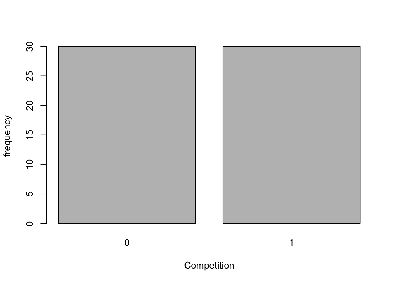
barplot(table(companyd[, 7]), xlab="Type", ylab="frequency")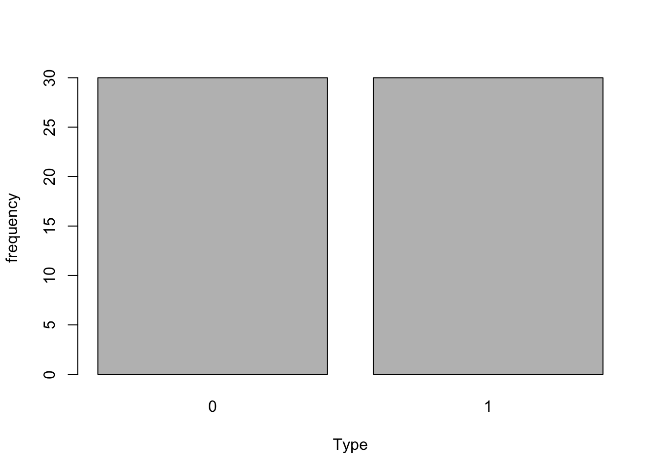
pie(table(companyd[, 6]), labels=names(companyd$Sector), col=c(3, 7, 5), main="Sector") 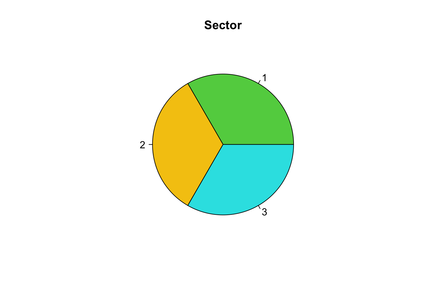
We have learnt that a histogram is appropriate to graphically explore a measured variable.
hist(companyd[, 1], xlab="Share Price", main="Histogram of Share Price", col="gray")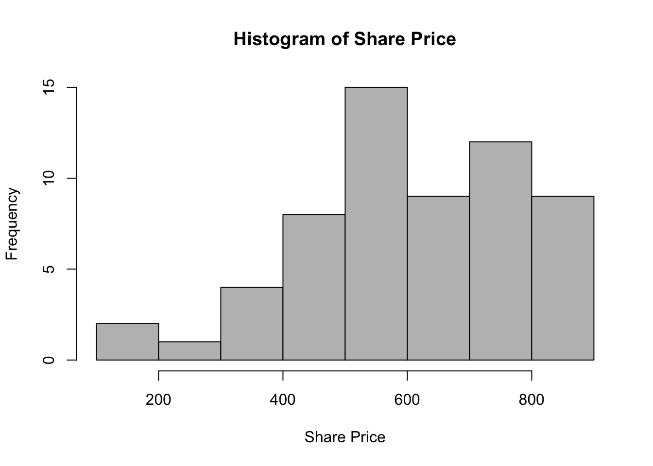
To see the density smoothing of the histogram, on your histogram you will plot the probability density rather than the freqeuncy of the measured variable, over which you can superimpose a kernel density smoothing line.
hist(companyd[, 1], xlab="Share Price", main="Histogram of Share Price", col="gray", prob=T)
lines(density(companyd[, 1]), col="red")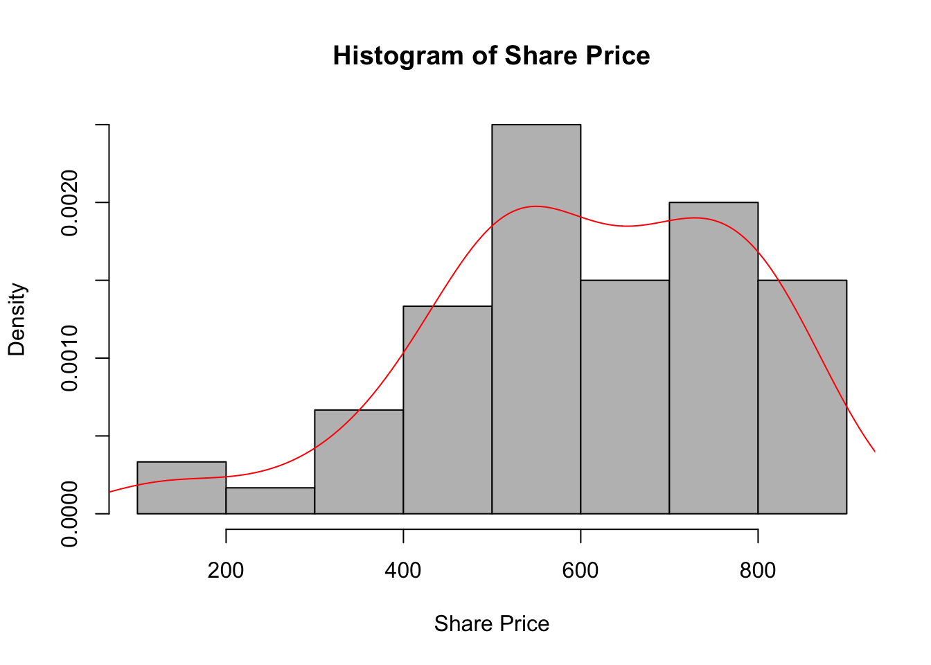
You can also have the kernel density smoothing as an individual plot.
par(mfrow=c(2, 2))  # splits the graph window into 2 rows and 2 columns
plot(density(companyd[,1]), main="Density Function of Share Price")
plot(density(companyd[,2]), main="Density Function of Profit")
plot(density(companyd[,3]), main="Density Function of R&D")
plot(density(companyd[,4]), main="Density Function of Turnover")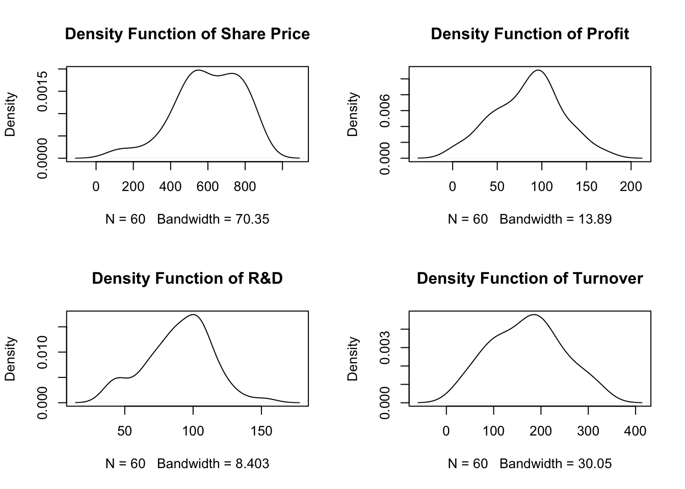
M vs A(2) Data Analysis
Exploratory analysis of the individual variables is an important part of the DA process as a way to familiarise with data and identify any anomalies that may be contained within the individual variables. However, the most exciting part of Data Analysis is the exploration of the possible relationships between the variables and statistical modelling that we use in this part of the DA process.
The main focus in this study is the study of share prices of companies from three different business sectors, ultimately this will help us to identify the response variable for this study which is Share_Price that is a measured type. In this section we are learning how to investigate a possible relationship between measured response and attribute with two levels of explanatory variable. In this study there are two attribute variables with two levels: Competition and Type and both of those attribute variable seem reasonable to use as explanatory variables.
We will start the investigation for the case: Share_Price vs Competition.
Using data analysis methodology for M v A(2)
We first need to conduct the IDA For this part of the analysis we need to obtain the descriptive statistics and their visualisations in terms of the boxplots.
Step 1: Obtain the descriptive statistic of the response variable split down by each level of the attribute explanatory variable:
- Providing the average value of ‘Share_Price’ for all the companies who operate in a very competitive market (code 0) and the average value of ‘Share_Price’ for all companies that have a great deal of monopoly power (code 1).
with(companyd, tapply(Share_Price, Competition, summary))## $`0`
## Min. 1st Qu. Median Mean 3rd Qu. Max.
## 101.0 479.8 527.0 530.0 588.5 777.0
##
## $`1`
## Min. 1st Qu. Median Mean 3rd Qu. Max.
## 240.0 647.5 703.5 675.5 804.8 880.0with(companyd, tapply(Share_Price, Competition, sd))## 0 1
## 149.3169 175.2078with(companyd, tapply(Share_Price, Competition, IQR)) ## 0 1
## 108.75 157.25Once we get the required statistics, we need to interpret these descriptive statistics of the two sub-distributions in order to make a conclusion about their equality, i.e. similarity, as we are working with sample data. In other words, based on the statistics obtained, we need to answer the following question: Are the sub-distributions the same or different?
Descriptive statistics describe data – it summarises and organises all of the collected data into something manageable and simple to understand. Yet, it could be difficult to interpret, unless you are very in tune and familiar with the variables you are observing. If you already have some prior knowledge about the subject matter you will most likely know what to expect to see and the interpretation of the statistics will not be so troublesome. However, we can always convert those statistics to a visual form which is simpler to digest and understand.
Graphical visualisation of the two sub-distributions might help to answer this question! Boxplots are the standard graphical method of displaying this sort of data. Boxplots enable both the difference in means relative to their spreads (variability) to be assessed.
#par(mfrow=c(1,1))
boxplot(Share_Price ~ Competition, data = companyd, boxwex = 0.25, main="Share Price vs Competition", xlab ="Share_Price", ylab ="Competition", col=c("palegreen3", "orchid3"), horizontal=T) 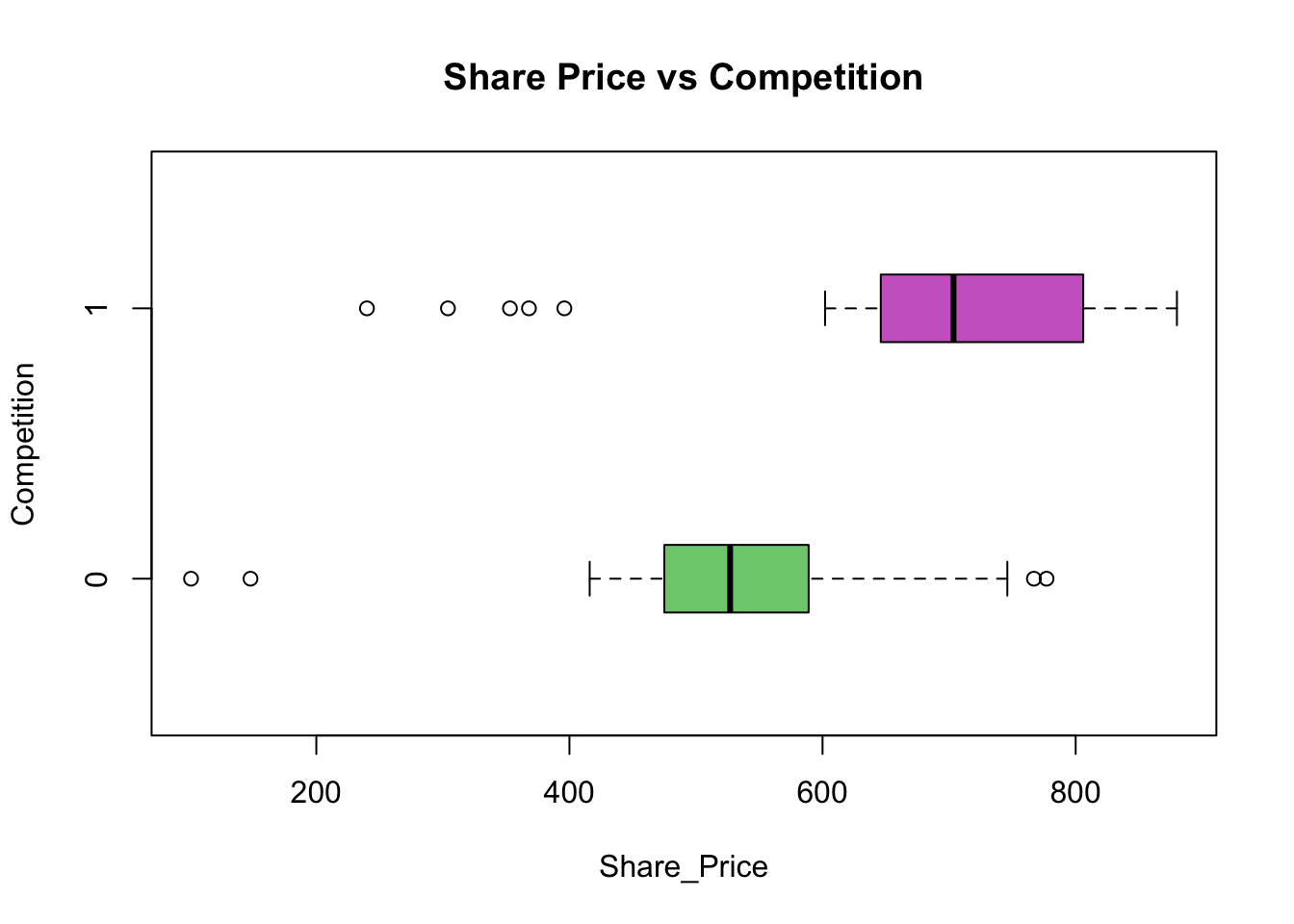
From the obtained descriptive statistics visualised by the Boxplots the means are 530.00 for the companies which operate in a very competitive market and 675.50 for the companies that have a great deal of monopoly power. The key question now is:
Is the difference between the two means (£675.50 – £530.00 = £145.50) indicating a real difference or is this difference one that could have occurred by chance as a result of sampling error?
This is a complex question but by matching the means and the boxplots obtained in the analysis against the boxplots for the three possible model outcomes discussed earlier when talking about methodology used form MvA(2), a suitable decision can be made. For the example Share_Price vs Competition given above the analytical process is described below:
By matching the boxplots against the three model outcomes illustrated in the data analysis methodology diagram, the absolute difference (as above of £145.50) has limited value in isolation because the interpretation depends also on the variability of the sample data. The variability of the sample data is measured in terms of the standard deviation, and represented in the boxplot as the inter-quartile range (IQR) as the width of the box. In this graphical display the boxplot enables both the difference in means relative to their spreads (variability) to be assessed. If the two boxplots appear to be one of top of the other, then the difference is consistent with sampling error. If, however the difference is such that the boxplots appear to be well separated, then the difference is indicative of a real difference in means and suggests that a connection/relationship is present. The in-between situation is a matter of judgement but if the means are different, and the boxes of the boxplots overlap considerably then this is indicative of the need for further data analysis.
From the sample evidence following Data Analysis Methodology, we can draw the conclusion that the market value of a company’s shares does depend on the competition within which the company operates. The average share price for the companies which operate in a very competitive market is £530.00, while for those that are operating with a great deal of monopoly power, it is £145.50 more.
The outcome of the IDA has led us to the above conclusion skipping the FDA stage.
We recognised that this common methodology has three stages:
- The Initial Data Analysis
- The Further Data Analysis
- Describing the Relationship
and that the Further Data Analysis stage may or may not be required, depending on the outcome of the ‘Initial Data Analysis’ at Stage 1. By conducting the analysis for Share_Price vs Competition, we have also realised that Stage 3 ‘Describing the Relationship’ is dependent upon establishing that a link exists between the response variable and the explanatory variable.
We will move further and learn how to conduct the Further Data Analysis required for this particular data analysis situation.
Further Data Analysis
If the Initial Data Analysis is inconclusive then ‘Further Data Analysis’ is required. This further data analysis seeks to answer the question:
Does the sample evidence support the viewpoint that there is no connection between the response variable and the explanatory variable, or does it support the view that there is a link?
Further Data Analysis is procedure that enables a decision to be made, based on the sample evidence, as to one of two outcomes:
- There is no relationship
- There is a relationship
These statistical procedures are called hypothesis tests, which essentially provide a decision rule for choosing between one of the two outcomes “There is no relationship” or “There is a relationship” based on the sample evidence.
This chapter we will discuss the mechanics of the application of the hypothesis test, and not attempt to discuss the underlying theory.
All hypothesis tests are carried out in four stages:
- Stage 1: Specifying the hypotheses.
- Stage 2: Defining the test parameters and the decision rule.
- Stage 3: Examining the sample evidence.
- Stage 4: The conclusions.
The data analysis situation Measured v Attribute requires two different hypothesis tests, one hypothesis test for the situation where the attribute explanatory variable has exactly two levels, and a different hypothesis test for the situation where the attribute explanatory variable has three or more levels.
HYPOTHESIS TEST: Measured Reponse v Attribute Explanatory Variable with exactly two levels
In the section above we started to investigate “does the explanatory variable Competition influence the response variable Share_Price?” The implication being does market value of the companies’ shares depend on the competitiveness of the market within which they operate. Based on the sample evidence we were able to draw a conclusion about the nature of this relationship by conducting only the IDA.
Let us suppose that the IDA was inconclusive and that FDA is needed in order to draw a conclusion about the relationship between the Share_Price and Competition.
For this data analysis situation (MvA(2)) the required further analysis is the Student’s t-test.
The four stages are:
Stage 1: Define the hypotheses:
- \(H_0: \mu_1 = \mu_2\)
- \(H_1: \mu_1 \ne \mu_2\)
Stage 2: Defining the test parameters and the decision rule
For the ‘M vs A’ problem, what is required to help decide based on the sample evidence between the two options H0 & H1 is a measure of the relative separation of the boxplots. This relative measure should consider the difference between the two means and the variability of the data for both levels of the attribute. This measure of the relative separation of the boxplots should take into account the means and the standard deviations of the two samples.
An agreed decision rule can be formulated that specifies that if this relative measure of the separation of the boxplots is greater than a threshold value then there is a connection, otherwise there is no evidence to support a link.
Such a measure of the relative separation of the boxplots exists and is called the ‘Student’s t Ratio’. The value of the t-ratio calculated from the sample data is normally called \(t_{calc}\) to emphasis the fact that it is calculated from sample data.
A decision rule can now be formulated using the \(t_calc\) value. The bigger the \(t_calc\) value the larger the separation between the boxplots and the more likely it is that there is a link between the response variable and the explanatory variable. The decision rule specifies the range of values that can be taken to be consistent with \(H_0\), i.e. no connection. If the \(t_calc\) is outside that range then the decision rule is specifying that the sample data is consistent with \(H_1\), namely with there being a connection.
The problem now is how to specify the agreed limits. W. S Gossett (1876-1937) who wrote under the pseudonym of “Student” proposed the t-ratio in a paper published in 1908. He also evaluated the statistical distribution of the t-ratio to enable these threshold values to be obtained. This test procedure is called a hypothesis test and the test described is commonly referred to as the student’s t-test.
The agreed procedure for setting up the decision rule uses the distribution of the t-ratio and splits the area under the distribution into the proportions 2½% - 95% - 2½% giving the threshold value called \(t_{crit}\).
If \(t_{calc}\) value is numerically between the range \(-t_{crit}\) & \(+t_{crit}\) then the decision rule is flagging \(H_0\). Supporting the viewpoint that there is no relationship.
If \(t_{calc}\) value is numerically outside the range \(-t_{crit}\) & \(+t_{crit}\) then the decision rule is flagging \(H_1\). Supporting the viewpoint that there is a relationship.
The value \(t_{crit}\) depends upon the sample size, through a measure called Degrees of Freedom (df). The hypothesis test described above is called the student’s t-test and is a two tailed test using the 5% level of significance.
Reference to the tables of the percentage points of the student’s t distribution will show that one of the tabulations is the two tailed test at the 5% level of significance. The value obtained from the statistical tables will be referred to as (t_{crit}).
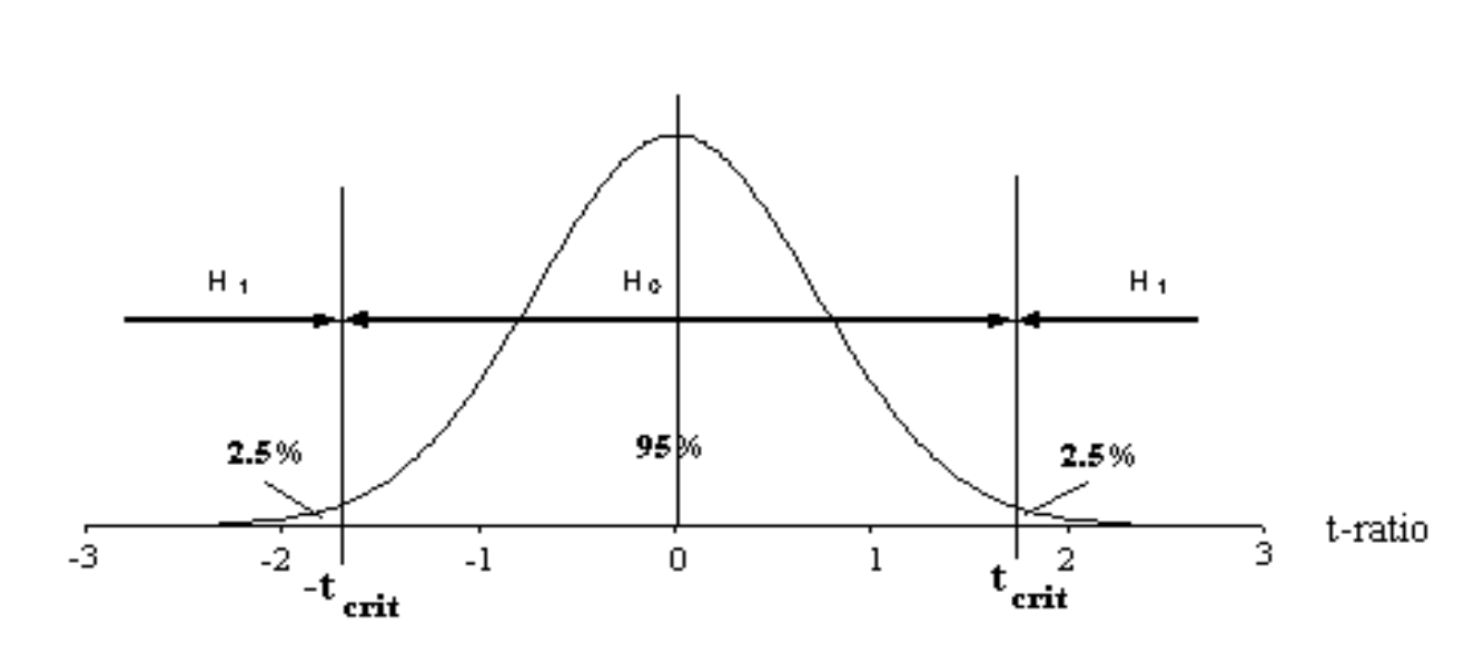
As we now realise, this stage calculates two key pieces of information, the value of \(t_{calc}\) as calculated from the sample data and the degrees of freedom. The degrees of freedom are required to enable the numerical value of \(t_{crit}\) to be looked up in the statistical tables or simply in R using the qt(alpha, df) function.
- Stage 3: Doing the calculations:
In practice this means using the sample data to calculate two things:
The numerical value of \(t_{calc}\) and the value of the degrees of freedom (df). This provides all the information to complete the test, the df figure enables the precise value of t_calc to be looked in the statistical tables or directly obtained in R. Once this value is known, the conclusion results?? by applying mechanically the decision rule as seen above:
If \(t_{calc}\) value is numerically between the range \(-t_{crit}\) & \(+t_{crit}\) then the decision rule is flagging \(H_0\). There is no relationship.
If \(t_{calc}\) value is numerically outside the range \(-t_{crit}\) & \(+t_{crit}\) then the decision rule is flagging \(H_1\). There is a relationship.
- Stage 4: The conclusions.
This final stage requires a statement of the outcome in terms of the original problem specification.
FDA: Share_Price vs Competition
Let us obtain the output for t-test for Share_Price vs Competition.
t.test(Share_Price~Competition, data=companyd)##
## Welch Two Sample t-test
##
## data: Share_Price by Competition
## t = -3.4619, df = 56.578, p-value = 0.001028
## alternative hypothesis: true difference in means is not equal to 0
## 95 percent confidence interval:
## -229.67541 -61.32459
## sample estimates:
## mean in group 0 mean in group 1
## 530.0333 675.5333In the output above we can see the statistics for the model that has been fitted: Share_Price Vs Competition. For this sample the t_calc is -3.4619 (\(t_{calc}=-3.46\)) and the degrees of freedom are 56.578 (\(df=56\)). Those are the two numbers that we need from this output that will enable us to test the hypotheses.
In order to test the hypothesis we need to obtain the critical value of the student’s t-ratio for \(df=56\), thus we want the \(t_{crit}\). We use the qt(p, df) function in R, which stands for quantile of t distribution. Alternatively, you can use the statistical tables.
This is a two-tailed test of 5 percent significant level (thus, \(p = 1 - 0.5 / 2\)), so the critical value of Student’s t is:
qt(0.975, 56.578)## [1] 2.002789This means that in order to reject the null hypothesis our test statistic needs to be bigger than \(t_{crit}=2.00\), and hence conclude that there is a relationship between the two variables used in the analysis. \(t_{calc}=-3.46 < t_{crit}=2.00\) => \(H_1\), thus there is a relationship between the variables: Share_Price and Competition, hence DESCRIBE THE RELATIONSHIP!!!
This FDA was an unnecessary step in our DA for Share_Price vs Competition, as we were able to make a clear conclusion about the nature of the relationship by conducting IDA.
M vs A(>2) Data Analysis
The example of the Initial Data Analysis above uses a two level attribute explanatory variable. The IDA for a measured response against an attribute explanatory variable with more than two levels is exactly the same, the interpretation is a little more difficult due to the larger number of levels but the principles are exactly the same.
To make it as simple as possible, let us consider Data Analysis Methodology for the situation of M vs A(3).

A way of examining the boxplots is to focus on the two boxplots, with the smallest mean and the largest mean, and treat them as a two-level attribute variable.
Definition of connection/link:
To detect a connection/link between the response variable and the explanatory variable requires a clear definition of exactly what a connection/link is.
The formal definition of no link is: If the average value of the response variable is independent of the level of the attribute explanatory variable then the response variable and the attribute explanatory variable are independent (not connected).
Conversely: If the average value of the response variable is dependent on the level of the attribute explanatory variable then the attribute explanatory variable influences the value of the response variable, so the response variable and the attribute explanatory variable are connected.
If the sample evidence is inconclusive then further data analysis is required.
If further data analysis is required then it takes the form of a hypothesis test. The data analysis situation Measured v Attribute requires two different hypothesis tests. A hypothesis test for the data analysis situation where the attribute explanatory variable has exactly two levels has been discussed earlier in this chapter.
A different hypothesis test is required for the situation where the attribute explanatory variable has three or more levels. The principles remain the same; if there is no connection then by definition all the true means will be the same, whilst if there is a connection then the means are likely to be different. The problem is exactly the same as with the two level attribute situation, namely, is the difference between the means large enough to suggest that there is a real difference, or is the difference a difference that could have occurred by pure chance? (The difference is within the limits of sampling error).
Observing the output of the IDA used in data analysis methodology for MvA(>2) we focus on the differences between the means of the response variable split by the levels of the attribute explanatory variable. Put simply, we check are the all boxplots on top of each other, which would indicate no relationship between the two variables, or is there at least one difference, indicating a clear relationship between the two variables. We need to ask: Is the separation sufficient to conclude that there is a connection?
In exactly the same way as for the two level attribute explanatory variable, what is needed is a measure of the relative separation of the boxplots. If this relative measure is small then this is indicating very little separation and suggesting no connection. If this relative measure of separation is large then this is suggesting that there is a connection. The hypothesis test utilises such a measure and provides a way of deciding a threshold value for the relative measure of separation. If the value is smaller than the threshold then there is no connection, but if the relative measure is larger than the ‘threshold value’ then there is a connection.
The hypothesis test
Like all hypothesis tests, this particular test is carried out in four stages:
- Stage 1: Specifying the hypotheses.
- Stage 2: Defining the test parameters and the decision rule.
- Stage 3: Examining the sample evidence.
- Stage 4: The conclusions.
We will start the investigation for the case: Share_Price vs Sector, variable coded:
- 1 if the company operates in the IT business sector
- 2 if the company operates in the Finance business sector
- 3 if the company operates in the Pharmaceutical business sector
We need to investigate if the market value of a company share depends upon the sector within which the company operates.
Stage 1: Specifying the hypotheses
By definition, if there is no connection then all the population means are equal, whilst if there is a connection at least one of the means must be different, this defines the null and alternative hypotheses:
- \(H_0: \mu_1 = \mu_2 = \mu_3\)
- \(H_1: \text{at least one mean is different.}\)
In the context of the example (\mu_1) is a mean value of a company share, which operates in the IT business sector, (\mu_2) is a mean value of a company share, which operates in the Finance business sector, etc.}
Stage 2: Defining the test parameters and the decision rule.
The decision rule is based on the F-ratio. The test procedure is called One-way Analysis of Variance and was originally devised by R. A. Fisher, who proposed the Analysis of Variance hypothesis test. The term F-ratio is a reference to Fisher.
Analysis of Variance is often abbreviated to ANOVA.
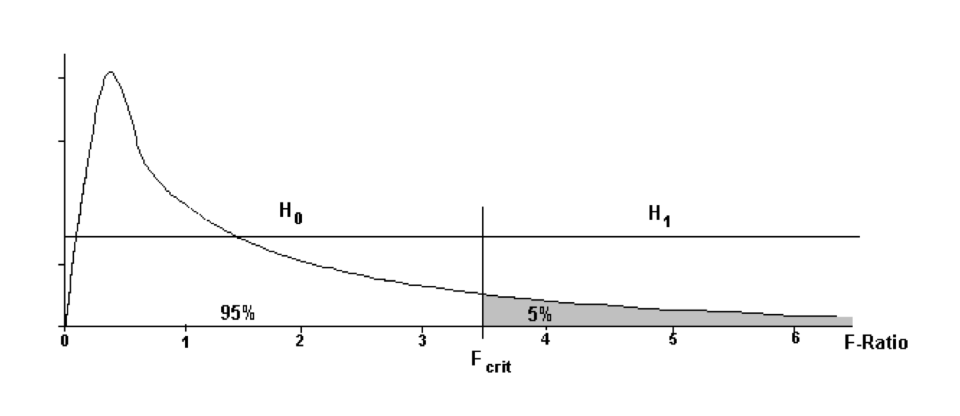
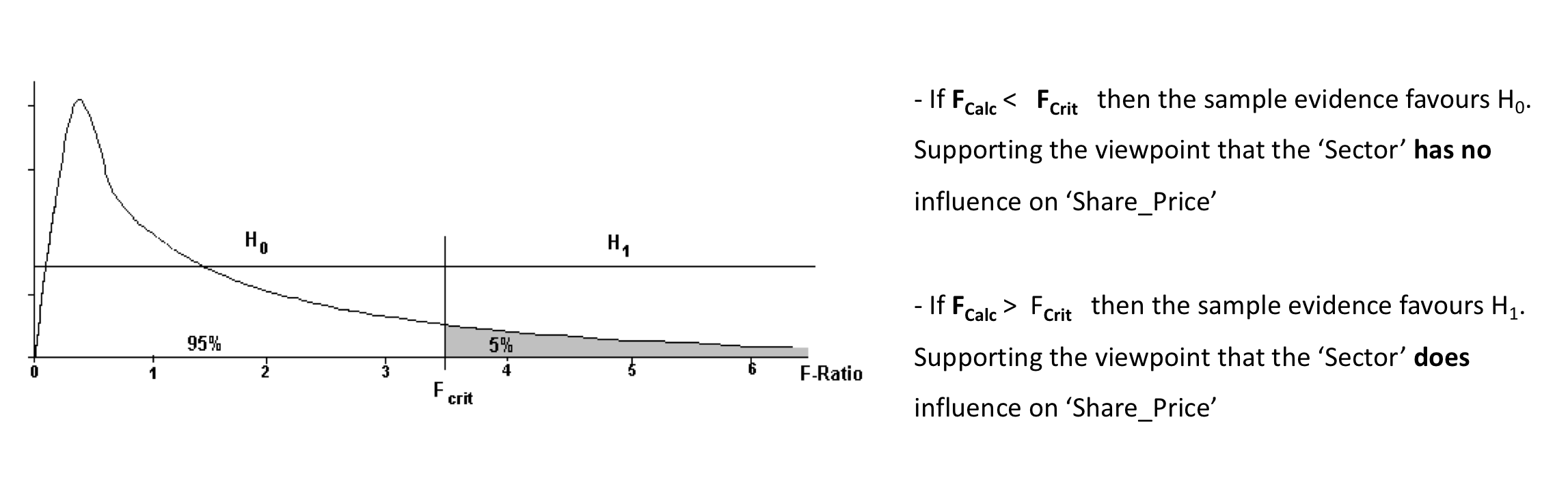
\(F_{crit}\) is the particular value of F that split the area under the distribution in the proportions 95% / 5%.
The decision rule is:
If the value of F_calc is between 0 and F_crit then conclude that **there is no link \((0 < F_{calc} < F_{crit})\)
If the value of Fcalc is greater than Fcrit then conclude that on the basis of the sample evidence **there is a link \((F_{crit} < F_{calc})\)
Stage 3: Examining the sample evidence.
The \(F_{calc}\) value, as with the \(t-{ratio}\) is a relative measure of the separation of the boxplots.
If the boxplots are nearly on top of each other, the \(F_{calc}\) value would be small. The F-Ratio is defined in such a way that if the null hypothesis is true, i.e. all the means are equal then the \(F_{calc}\) value is expected to be 1.
If the boxplots are relatively well separated, the \(F_{calc}\) value measures this relative separation, and the wider the separation the larger the \(F_{calc}\) value.
TThe decision rule is simply an agreed threshold value. If the \(F_{calc}\) value is smaller than the threshold value then the agreement is that the sample evidence is consistent with no link. If the \(F_{calc}\) value is larger than the threshold value the agreement is that the sample evidence is consistent with a link.
To complete the test parameters the value of F_crit needs to be determined, and this depends on the amount of data contained within the sample. As with the t-ratio the sample size plays a role through the degrees of freedom. In the case of the F-ratio, there are two degrees of freedom, and these are used to look up the value of F_crit in the statistical tables or when using the R function qf(p, df1, df2).
Stage 4: The conclusions
Let us go back to our Worked Example: Share_Price vs Sector to put this “theory” into practice.
First we obtain simple descriptive statistics of Share_Price for each of the three levels of Sector attribute variable:
with(companyd, tapply(Share_Price, Sector, summary))## $`1`
## Min. 1st Qu. Median Mean 3rd Qu. Max.
## 101.0 389.0 499.5 480.4 658.8 701.0
##
## $`2`
## Min. 1st Qu. Median Mean 3rd Qu. Max.
## 304.0 512.2 559.0 595.4 743.0 799.0
##
## $`3`
## Min. 1st Qu. Median Mean 3rd Qu. Max.
## 574.0 600.2 738.5 732.5 828.2 880.0with(companyd, tapply(Share_Price, Sector, sd))## 1 2 3
## 177.4745 143.3679 109.5322with(companyd, tapply(Share_Price, Sector, IQR))## 1 2 3
## 269.75 230.75 228.00Are the means the same?
The biggest difference is between group 3 and group 1. The smallest mean is for the company that operates in the IT business sector and the average value of the Share_Price of £480.40. The largest average is for the companies that operate in the Pharmaceutical business sector with the mean value of the ‘Share_Price’ of £732.60. Thus, the difference being (£732.60 - £480.40) = £252.20. Is this difference large enough to indicate a real difference or could it have arisen by pure chance from a sample where the true means are all equal?
Use your acquired knowledge! What was the difference between the two levels in the previous analysis? What conclusion did we draw?
We also notice the difference in standard deviations: st.dev. of ‘Share_Price" for ’Sector’ coded 1 is £177.47 and st.dev. of Share_Price for Sector coded 3 is £109.53. All of this indicate that we should examine the boxplots to get visual interpretation of the results above.
boxplot(Share_Price ~ Sector, data = companyd, boxwex = 0.25, main = "Share Price vs Sector", xlab ="Share_Price", ylab ="Sector", col=c("palegreen3", "orchid3", "cornflowerblue"), horizontal=T)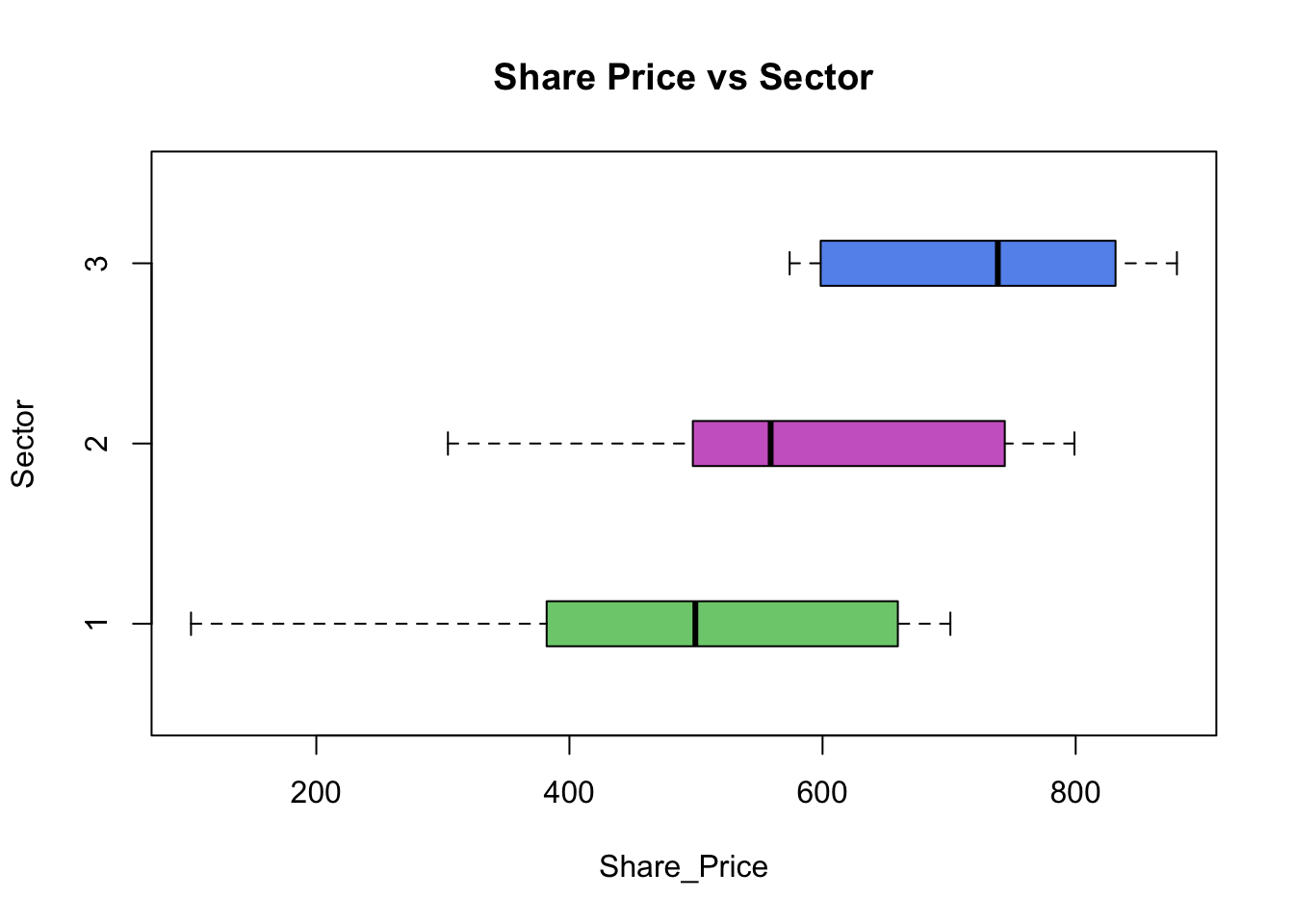
By examining the boxplots we can suggest that the information in the sample is inconclusive and more formal data analysis is required.
The Formal Data Analysis: The hypothesis test for Share_Price vs Sector
Stage 1: Specifying the hypotheses (H0 & H1)
- \(H0: \mu_1 = \mu_2 = \mu_3\)
- \(H_1: \text{at least one mean is different}\)
Stage 2: Defining the test parameters and the decision rule
Stage 3: Examining the sample evidence
To obtain the output in R for one-way ANOVA test used for MvA(>2) we use the oneway.test( ) function:
m1 <- aov(Share_Price ~ Sector, data = companyd)
summary(m1)
## Df Sum Sq Mean Sq F value Pr(>F)
## Sector 2 637432 318716 14.93 6.12e-06 ***
## Residuals 57 1216929 21350
## ---
## Signif. codes: 0 '***' 0.001 '**' 0.01 '*' 0.05 '.' 0.1 ' ' 1Remember that we have used the summary( ) function on the data.frame class object to obtain descriptive statistics of its variables. The function invokes particular methods which depend on the class of the first argument. The summary( ) function is also used to produce summary results of the various model fitted functions.
\(F_{calc}\) from the sample data is 14.93. Note that for F statistic we have two numbers for the degrees of freedom. The degrees of freedom \(df1=2.00\) and \(df2=57\) give us \(F_{crit}\):
F_crit <- qf(0.95, 2, 57)
F_crit
## [1] 3.158843\(F_{calc} = 14.93 > F_{crit} = 3.16 => accept H_1\), ie. ‘Share Price’ depends upon ‘Sector’ within which the company operates. The next question is how? Accepting \(H_1\) means that the ANOVA-test indicates that at least one group is different from all the others. Who is different from who? We need to fully describe this relationship, by pointing out which groups are different from which.
A Boxplot will often help you to recognise the obvious differences, but we have proceeded to do one-way ANOVA because those differences were not obvious. How to overcome this obstacle? We need a clear description of the relationship found, pointing out where the difference lays. To do this, we need a pairwise comparison between the groups, which in our case are:
| 1st with 2nd | 1st with 3rd | 2nd with 3rd |
|---|---|---|
| \(H_0: \mu_1 = \mu_2\) | \(H_0: \mu_1 = \mu_3\) | \(H_0: \mu_2 = \mu_3\) |
| \(H_1: \mu_1 \ne \mu_2\) | \(H_1: \mu_1 \ne \mu_3\) | \(H_1: \mu_2 \ne \mu_3\) |
This can be done using The Tukey multiple comparison procedure, for which we use the TukeyHSD( ) function.
John Tukey is an eminent statistician of XX century. He is credited with the invention of many graphical and numerical methods. One of them being the well used box plot.
The decision rule: Differences between Sectors are significant at 5% level if the confidence interval around the estimation of the difference does not contain zero.
TukeyHSD(m1)## Tukey multiple comparisons of means
## 95% family-wise confidence level
##
## Fit: aov(formula = Share_Price ~ Sector, data = companyd)
##
## $Sector
## diff lwr upr p adj
## 2-1 115.00 3.809878 226.1901 0.0411140
## 3-1 252.15 140.959878 363.3401 0.0000032
## 3-2 137.15 25.959878 248.3401 0.0119886This can be visualised by a plot of the list:
plot(TukeyHSD(m1))
Looking at the output above and the plot of those 95% CI’s we can see that none of them contains the value of zero. The implication of this is that for all three pairwise comparisons we acept H1. Looking at the output of the descriptive statistics we can conclude: \(\mu_1 < \mu_2 < \mu_3\). Now we can make the conclusion for our analysis.
Stage 4: The conclusions.
Based on the sample evidence there is a relationship between ‘Share Price’ and ‘Sector’. Companies operating in the IT business sector on average have the smallest value of the share price, which is 489.4 units. For the companies operating in the finance business sector the average value of the share price is 595.4 units. The largest average value of the share price is for the companies operating in the pharmaceutical sector, which is 732.6 units.
Based on the sample evidence there is a relationship between ‘Share Price’ and ‘Sector’. Companies operating in the IT business sector on average have the smallest value of the share price, which is £489.40. For the companies operating in the finance business sector the average value of the share price is £595.40. The largest average value of the share price is for the companies operating in the pharmaceutical sector of around £732.60.
YOUR TURN 👇
- Investigate the nature of the relationship in Share Price Study data for
Share_Price vs Type.
Check out this tweet and learn more about the #rstats boxplots:
I learned A TON about #rstats boxplots, as well as new and old features in #ggplot2 creating this blog post:https://t.co/eYnhSjq0iP
— Laura DeCicco (@DeCiccoDonk) August 10, 2018
Take your own deep dive into the world of boxplots and ggplot2. pic.twitter.com/1jVkImwvZN
© 2020 Tatjana Kecojevic